
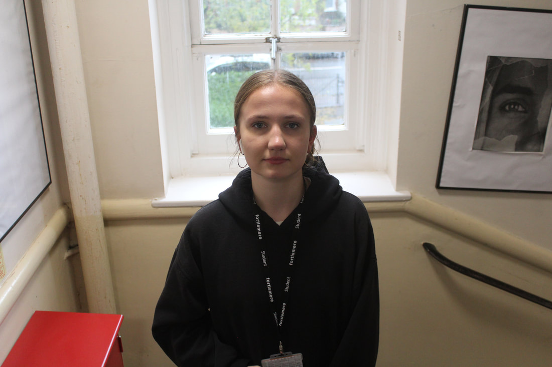
Selfie
Selfie Origin:
Photographic self-portraits can be traced back to the origins of photography. One of the first things photographers did when they learned how to fix light on a surface was to turn their rudimentary cameras on themselves. The earliest known example comes from 1839, the same year that Louis Daguerre patented the 'invention' of photography as a commercially viable process. Since then, the self-portrait, a genre inherited from painting, has become a staple form of photographic image making.
What is a selfie?
It is used today to infer a photographic self-portrait taken on a mobile device and shared via social media. In 2013, "Selfie" was word of the year in the Oxford English Dictionary. The inclusion of front facing cameras on smart phones and the popularity of social media sites like Instagram and Snap-chat have made the posting of Selfies increasingly popular as a form of photographic self-expression.
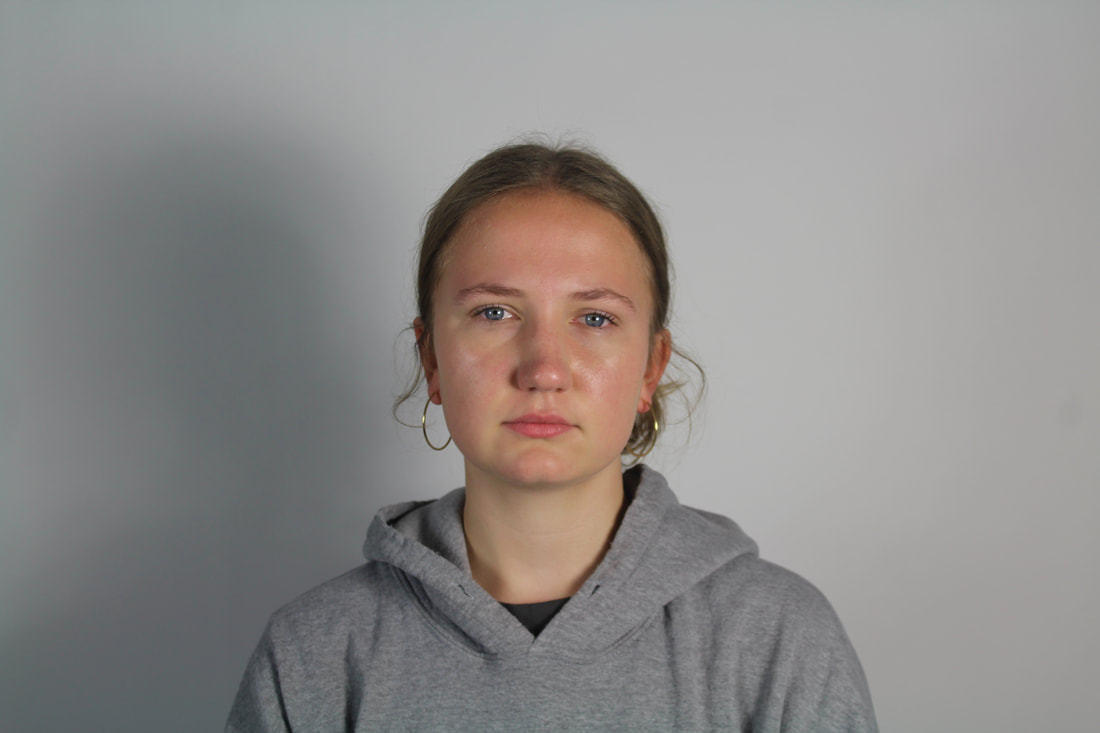
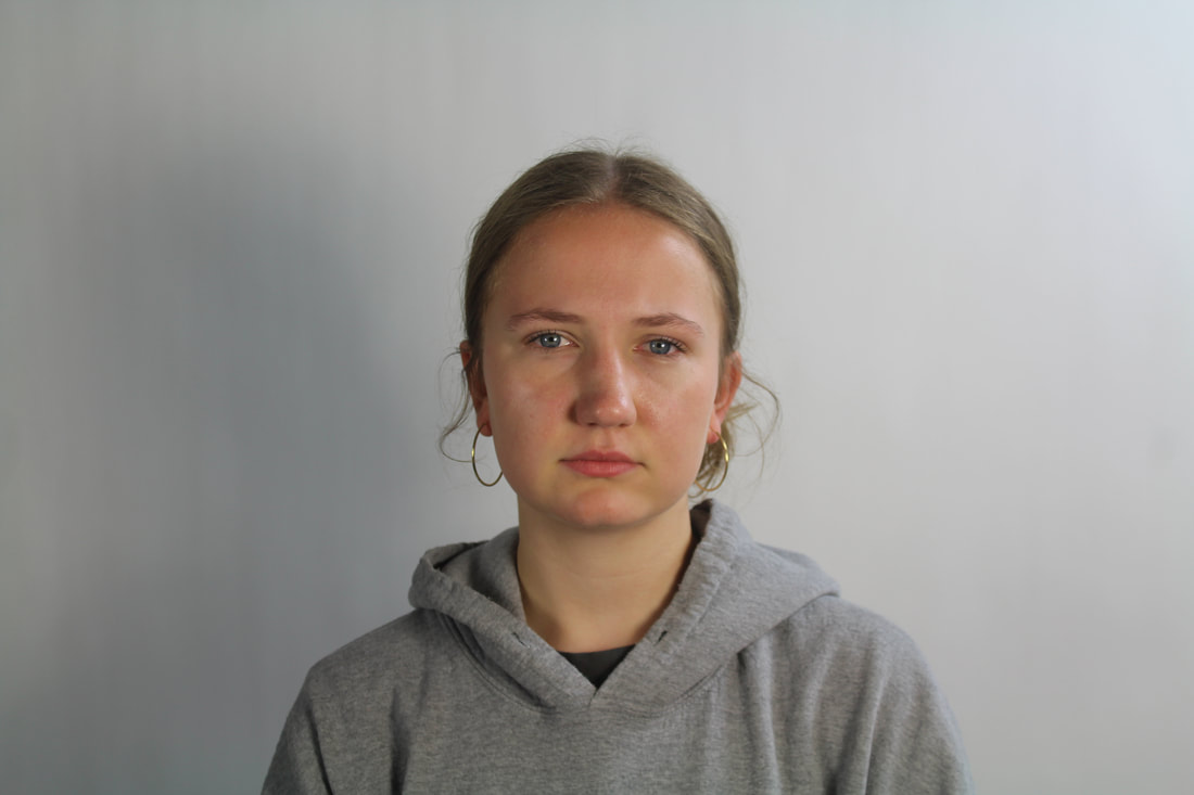
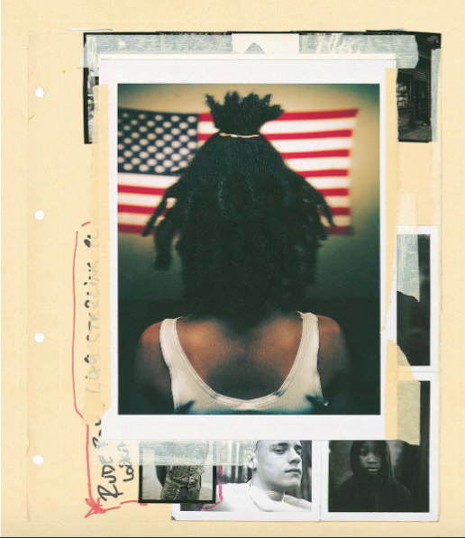
Photograph Selfie Experiment #1: The Reflected Selfie
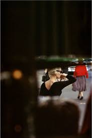
Lee Friedlander
|
|

|
Lee Friedlander is an American photographer and artist. In the 1960s and 1970s, Friedlander evolved an influential and often imitated visual language of urban social landscape, with many of his photographs including fragments of store-front reflections, structures framed by fences, posters and street signs. Friedlander has made humorous and poignant images among the chaos of city life, dense natural landscape, and countless other subjects. Friedlander is also recognized for a group of self-portraits he began in the 1960s, reproduced in Self Portrait, an exploration that he turned to again in the late 1990s, and published in a monograph by Fraenkel Gallery in 2000.
My Response


|

|

|
Evaluation:
I like how in my image you can see me three times and you get a whole 360 of me because you can see both the front and the back of my head using the mirror in the right angle. I like how the closest version of me is hyper-focused and the other two a blurred slightly as this gives the impression they are further back, and that each version is separate. I prefer the images with white light as it looks cleaner and brighter in them. Also the white bright lighting matches my outfit as it is white. If I was to do another shoot I would use even more mirrors and have more of the person in the frame.
I like how in my image you can see me three times and you get a whole 360 of me because you can see both the front and the back of my head using the mirror in the right angle. I like how the closest version of me is hyper-focused and the other two a blurred slightly as this gives the impression they are further back, and that each version is separate. I prefer the images with white light as it looks cleaner and brighter in them. Also the white bright lighting matches my outfit as it is white. If I was to do another shoot I would use even more mirrors and have more of the person in the frame.
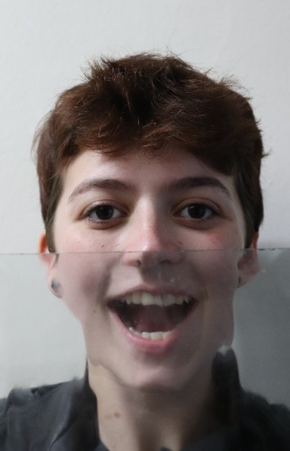
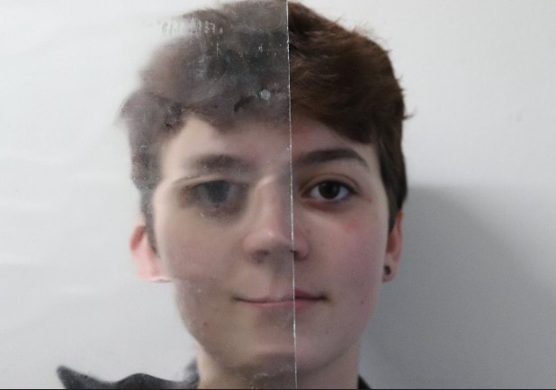
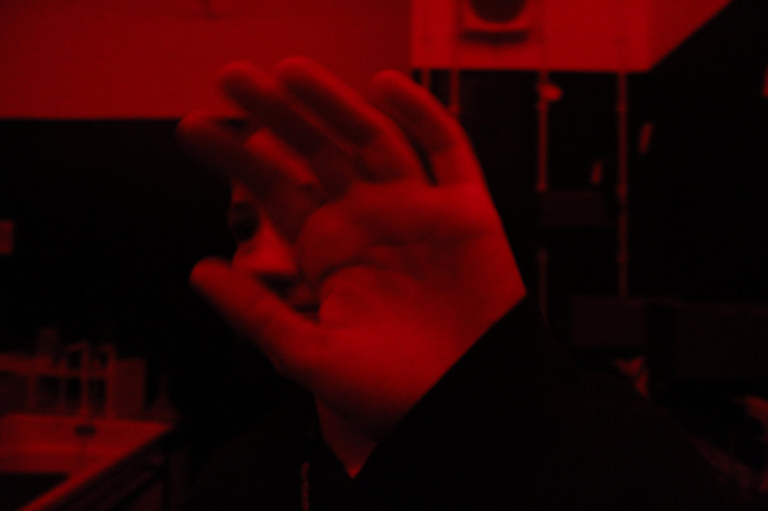
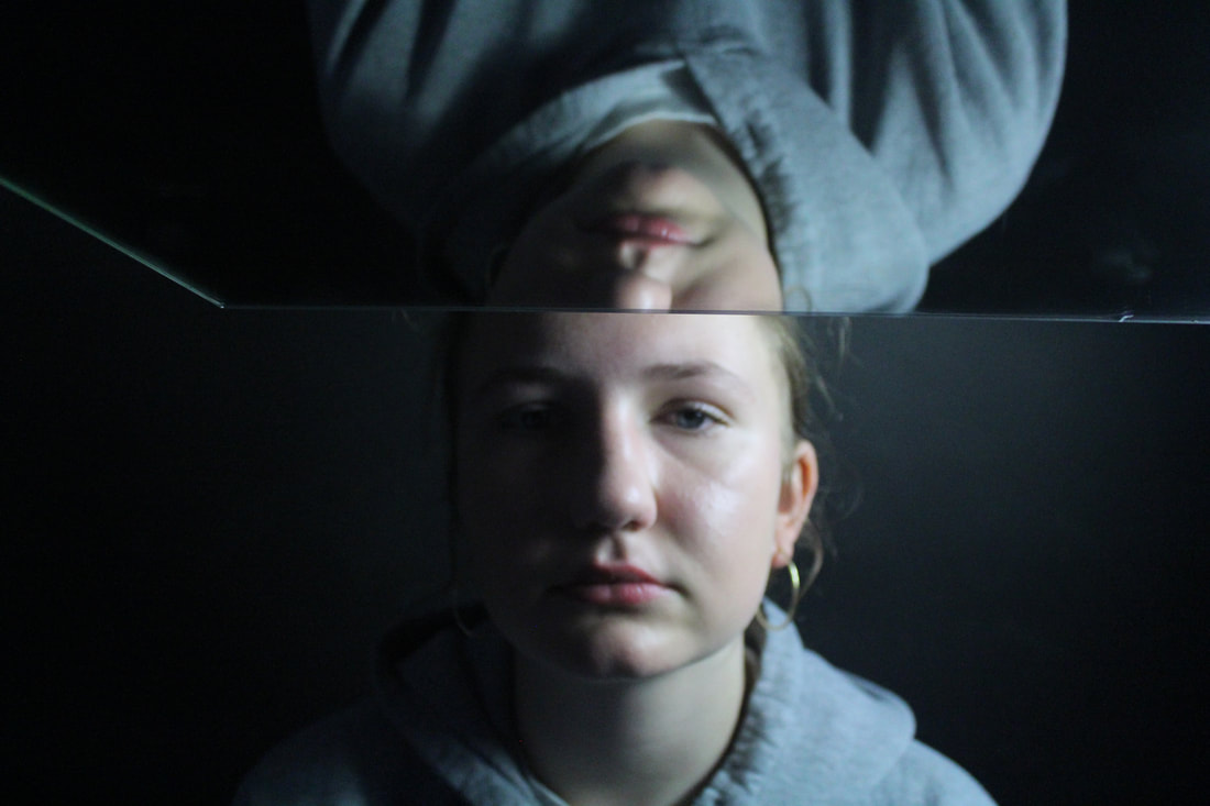
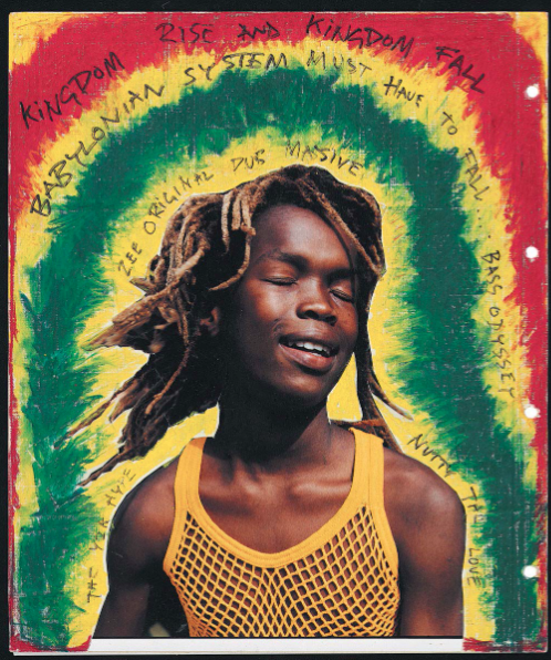
Photograph Selfie Experiment #2: The Obscured Selfie
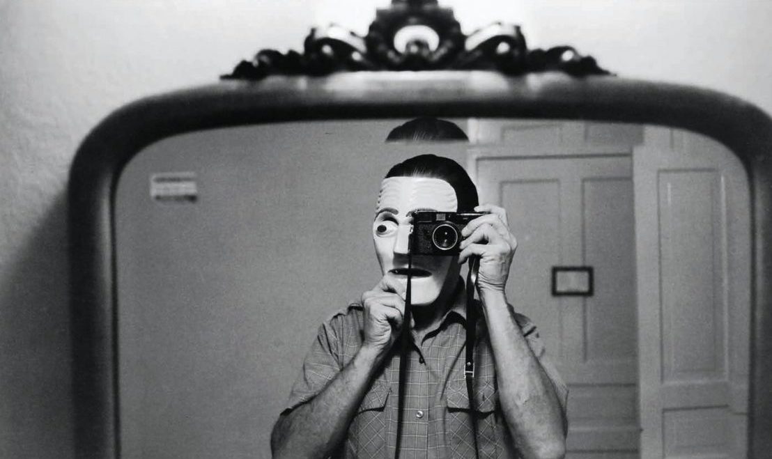
Erwin Blumenfeld


|

|
Erwin Blumenfeld's is one of the most influential photographers of the twentieth century. He is a experimenter and innovator, he produced an extensive body of work including drawings, collages, portraits and nudes, celebrity portraiture, advertising campaigns and his renowned fashion photography both in black and white and colour.
My Response:

|
|

|

|
Evaluation:
I like these images as the way my face has been distorted by the bumpy glass means some of my facial features has expanded and some have shrunken which shows a nice and abnormal contrast in my face which is not normally there. In the image I am smushing my face against the glass it further distorts my face in a nice way and catches the viewers eyes. My personal favourite image is the one where my mouth is open because it is happy but also there are nice ripples across my face and you can see the different the glass makes to my face all in on frame.
I like these images as the way my face has been distorted by the bumpy glass means some of my facial features has expanded and some have shrunken which shows a nice and abnormal contrast in my face which is not normally there. In the image I am smushing my face against the glass it further distorts my face in a nice way and catches the viewers eyes. My personal favourite image is the one where my mouth is open because it is happy but also there are nice ripples across my face and you can see the different the glass makes to my face all in on frame.
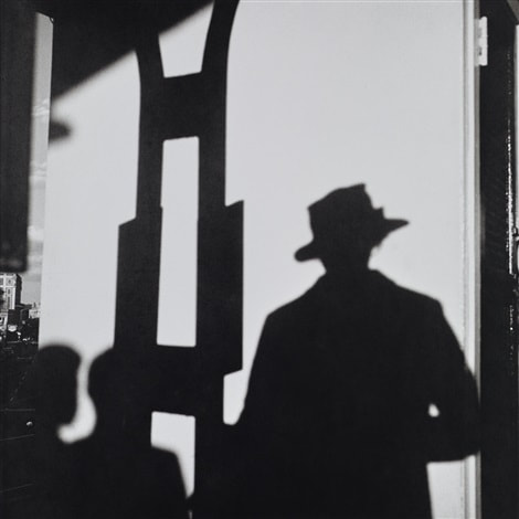
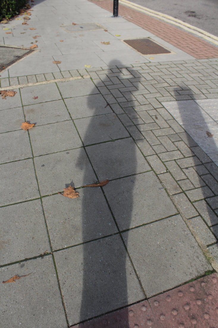
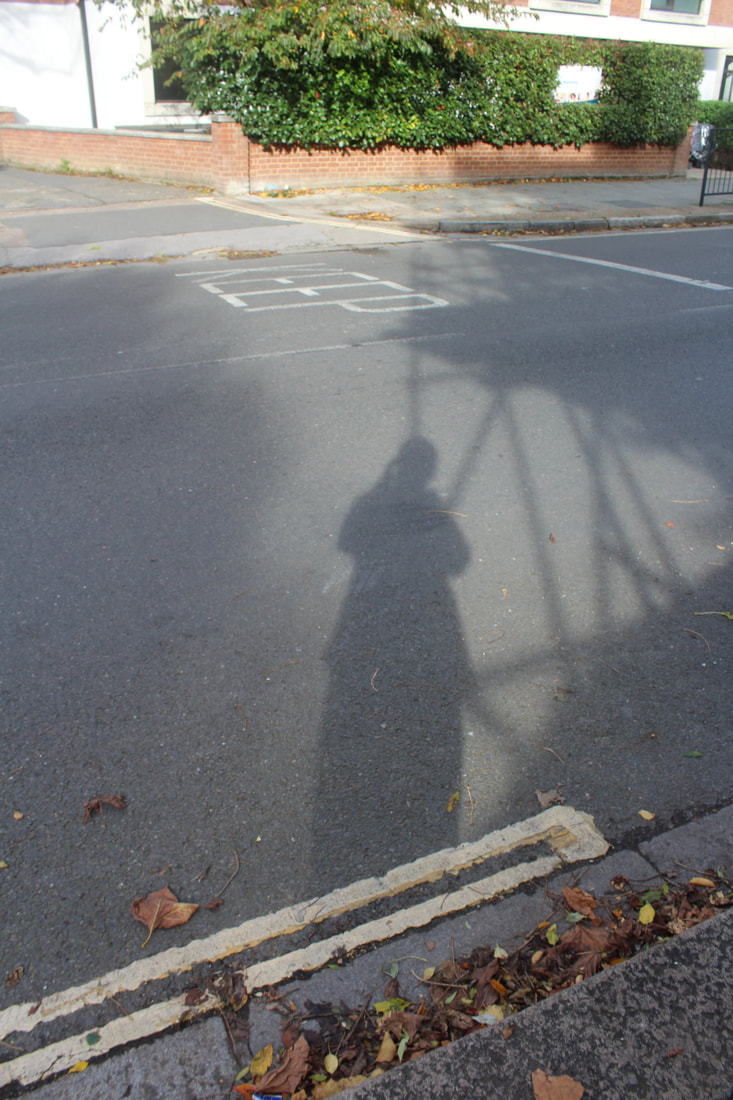
Photograph Selfie Experiment #3: The Shadow Selfie
Vivian Maier
|

|
|
An American street photographer born in New York City. Although born in the U.S., it was in France that Maier spent most of her youth. Maier returned to the U.S. in 1951 where she took up work as a nanny and care-giver for the rest of her life. In her leisure however, Maier had begun to venture into the art of photography. Consistently taking photos over the course of five decades, she would ultimately leave over 100,000 negatives, most of them shot in Chicago and New York City. Vivian would further indulge in her passionate devotion to documenting the world around her through homemade films, recordings and collections, assembling one of the most fascinating windows into American life in the second half of the twentieth century
My Response:
|
|
|
|
Evaluation:
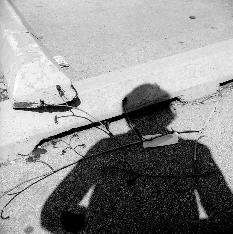
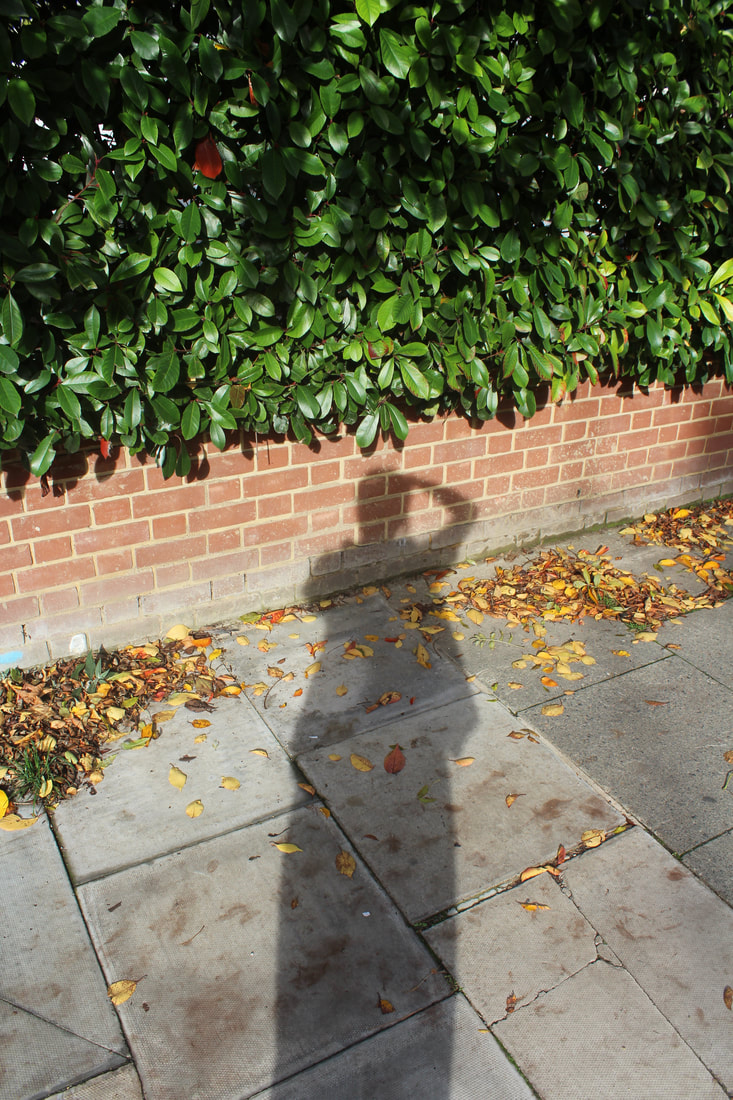
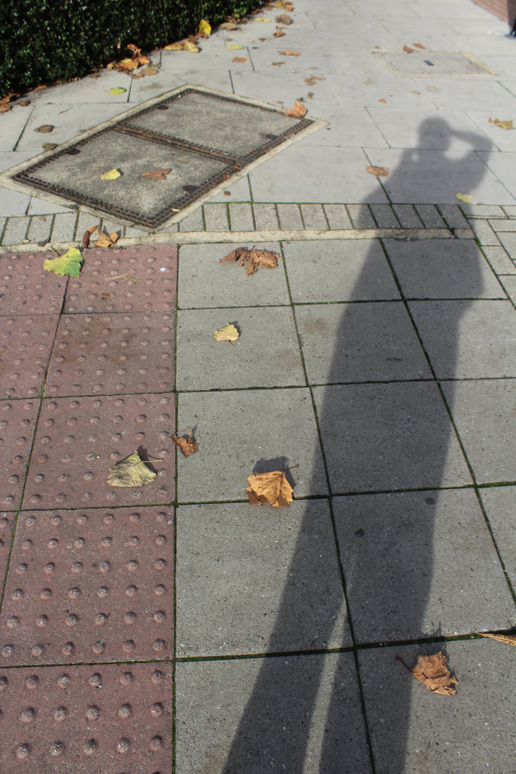
I like how in all these images all you see is a shadow/silhouette of my body as in all the other selfies you can see my whole face. I also enjoy how you see the whole length of my body and how the shadow stretches me across the pavement. My favourite image is the one where there is a bush in it as there are three different layers to it the green bush the orange brink and then the grey concreate and how my shadow is sectioned off in all the different sections. Also, the image where there are other shadows I think is good because it fills the frame more and shows the difference in the straight shadows to my body shadow. If I was to do another shoot I would put my shadow over lighter objects and background because it looks a bit dull and boring right now.
I like how in all these images all you see is a shadow/silhouette of my body as in all the other selfies you can see my whole face. I also enjoy how you see the whole length of my body and how the shadow stretches me across the pavement. My favourite image is the one where there is a bush in it as there are three different layers to it the green bush the orange brink and then the grey concreate and how my shadow is sectioned off in all the different sections. Also, the image where there are other shadows I think is good because it fills the frame more and shows the difference in the straight shadows to my body shadow. If I was to do another shoot I would put my shadow over lighter objects and background because it looks a bit dull and boring right now.
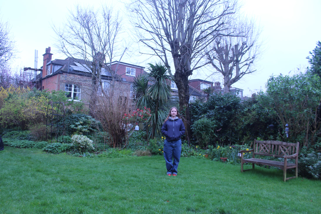
Lighting
LED light:

|
|
Natural light from a window:
|
|
Turned away from window:
|
|
Under LED Light:
|
|
Dark Room Light:
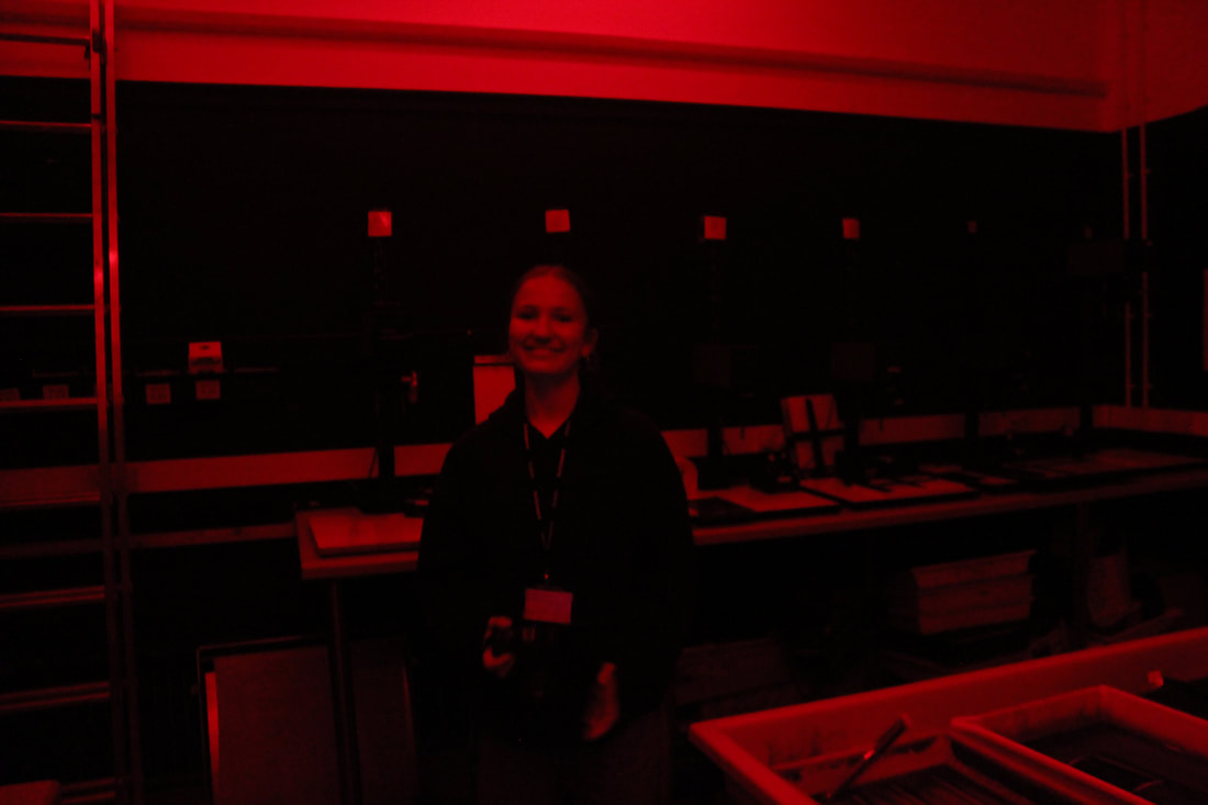
|
|
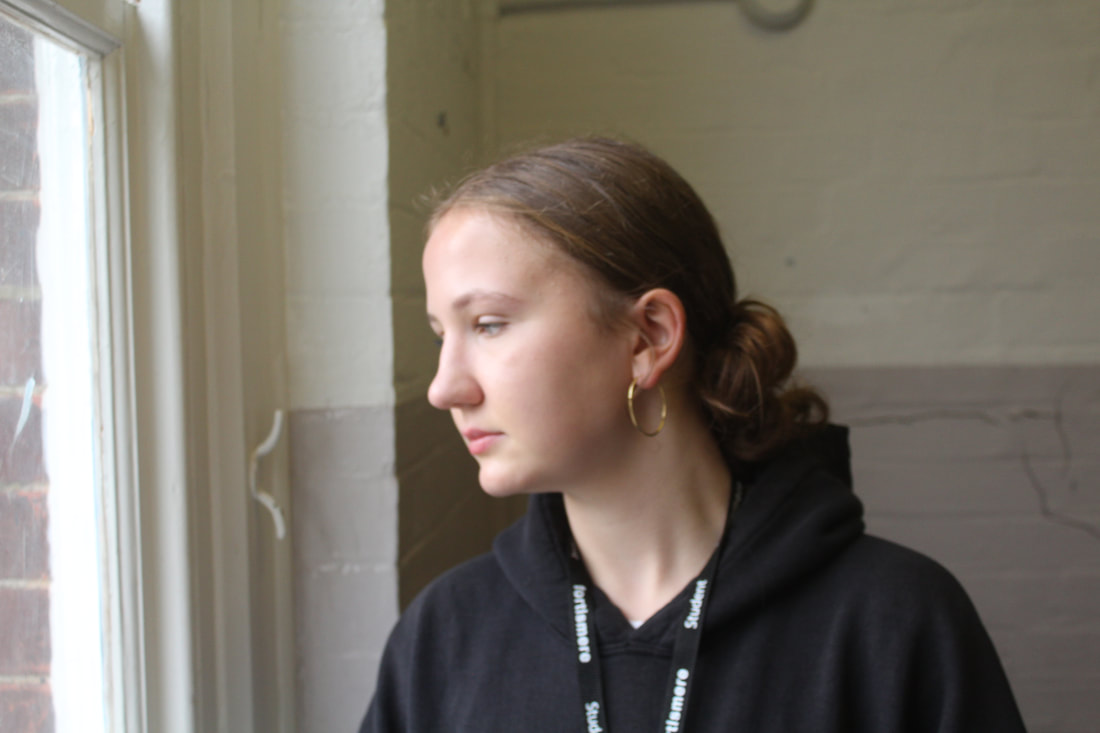
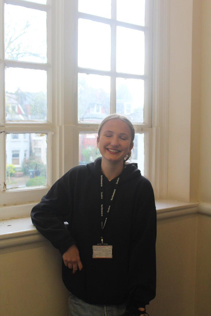
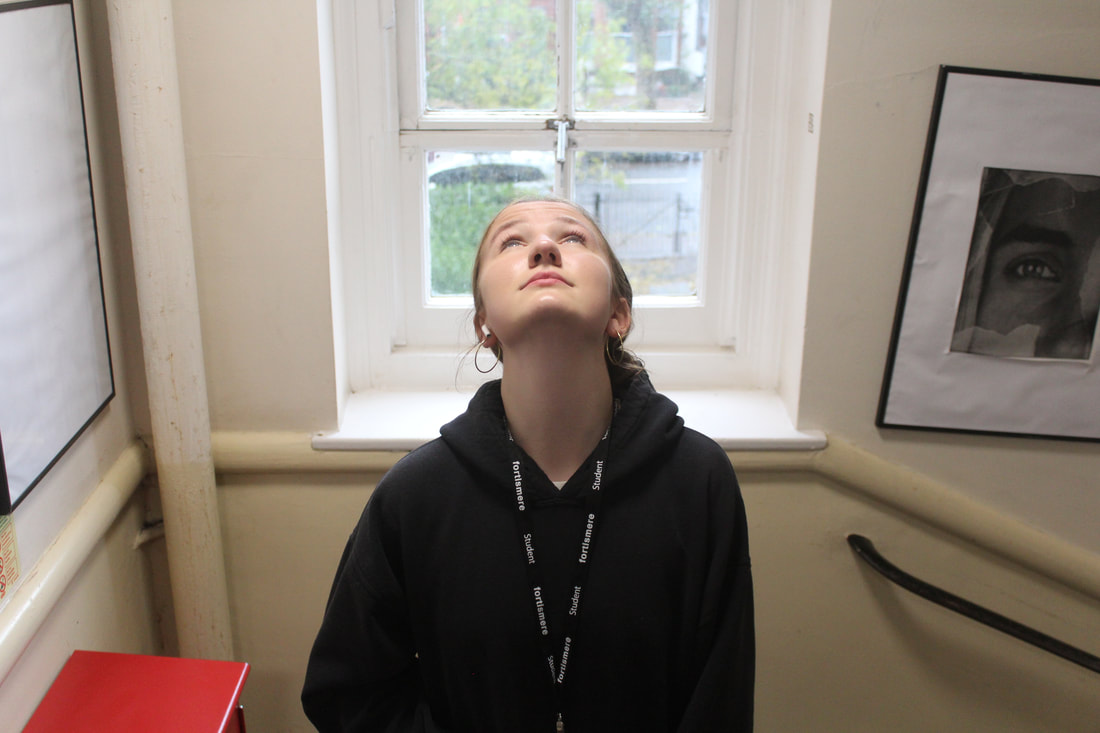
For this task we were asked to take images of a model in different places in the school to experiment with different lighting and how it effects an image. I've learnt how depending on the angle of light and the angle of the model different parts of the models face are highlighted and a harsher or softer effect is created. My least favourite lighting style I tried was lighting behind my model from a window with the model faced away from the window because it makes the background to bright and so it is unfocused and takes away from the model. It also doesn't light the model well and the light source is behind her. One of my favourite lighting types I tried was natural lighting from a window as it isn't a harsh light and is still very bright as not a too white or dark light. It is also very easy to achieve and already looks good without the model doing anything.
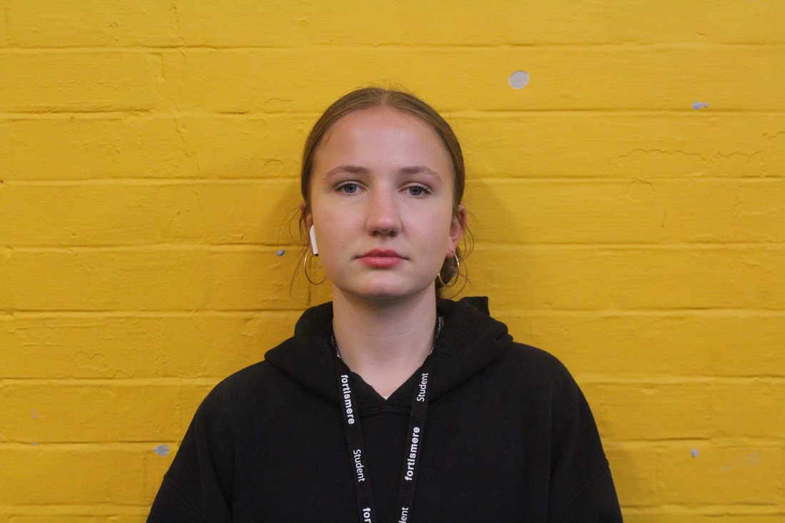
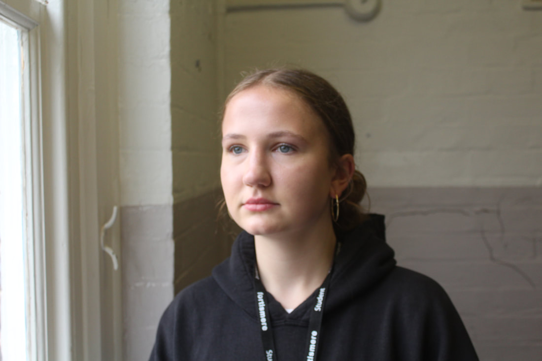
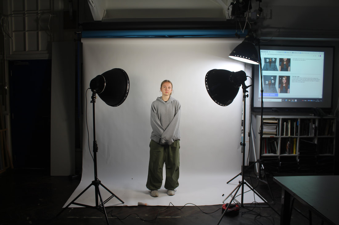
Studio Lights:
|
|
|
The Main Light The Fill Light The Hair Light
|
In this task I used the studio lights to see what difference the position of a light makes on my model and the overall image. The main light creates shadows on the face and has a shadow on the left side of the image. Most photographers don't want this on their images and models face so they use the fill light to get rid of the shadow and the shadows on the models face. Finally, the hair light lightens the whole image more and brightens up the model's hair. You can see the progression and difference in the image as you change the lighting. This shows how lighting impact an image a lot and how important good lighting is. I use natural lighting in most of my photos as I like how it isn't harsh and is a kind of soft lighting that doesn't create harsh lines on whatever I am photographing.
|
Myra Greene


|

|
Myra Greene is an American artist who has worked on a number of projects. Through her work, Greene prompts thought-provoking questions about how individuals are often judged based on skin colour and other physical characteristics rather than on their character. Growing up in the predominantly black neighbourhood of Harlem, New York, yet attending mostly white schools in the Upper East Side of New York, Greene has always been conscious of race and how it has influenced her personal narrative. "Character Recognition", Greene's use of high contrast black glass ambrotypes prompts viewers to consider the unidimensional way black individuals are viewed in society. Greene's close-up and tightly framed images of portions of her own face prompt an uncomfortable answer to the questions the collection's title implies about whether she and black people in general, are judged by their skin colour rather than by their character. By using black glass ambrotype, Greene inclines viewers to associate and compare the images in her collection with historical images of African American slaves taken in the 19th century that were intended to be used as species identifications in science textbooks. This linkage to historical African American slave roots makes these images powerful reminders of the commodification and stereotyping Greene spotlights through the materials and medium she used to create this collection.
My First Response:

|


|
My Second Response:

|


|
Evaluation:
I took the first photos at school of my friend Izzy with studio lighting and a plain background. I prefer how these images turned out because I had access to studio lights which are white and can be manipulated however I like. My second response was of a different model and was taken at home without studio white lights and only natural, yellow light which my bedroom has. There are also less shadows in my first response which I tried to combat in my second response by having my model look up or tilt their head but that changed the angle of their face in my image. I also really like how in focus my first images are and how nice that makes my prints and edits look.
I took the first photos at school of my friend Izzy with studio lighting and a plain background. I prefer how these images turned out because I had access to studio lights which are white and can be manipulated however I like. My second response was of a different model and was taken at home without studio white lights and only natural, yellow light which my bedroom has. There are also less shadows in my first response which I tried to combat in my second response by having my model look up or tilt their head but that changed the angle of their face in my image. I also really like how in focus my first images are and how nice that makes my prints and edits look.
Astone Prints
I've really enjoyed this project so far because I like experimenting with the paper using take, paint brushes and tape. I think it created a really intriguing and vintage look to all my finished images. I like how I'm able to make very clear images with my digital camera but then manipulate my image into looking older and make it look like it was taken in the same way as Myra Greene. After doing mu test strips with 1 second exposure each time I found that the best exposure was to do it for 1 second as that created the brightest images. Painting on my light sensitive paper with developer was my favourite thing to do in this task because I liked how I only developed certain bits of my image at a time, and I could us different amounts and different times to change the image a lot. The black and white look to the images after I print them makes the images their own and nowadays this isn't seen as much. I also really like the message between this Myra Greene project and how it is drawing attention to the problems black people face that some people don't even think about.
Test Strips:

Printed Images:

|

|

|

|

|

|

|
Evaluation:
My most successful images I think are the ones I exposed for 1 second and only developed them for a short amount of time with not a lot of spray and put it in careful and deliberate places. Also, the ones that have a lot of masking tape are very successful and they continue to make the image more rustic looking. My favourite two images are the ones at the top because I like how clear the nose and eye are in the images and that your attention is drawn towards them. I really like the effect the masking tape makes on both images and the developer dripping down the second image and the splatter effect on the first image. This was one of my favourite tasks to complete as i was allowed to make them however I wanted and use a lot of different techniques. I really liked using the different developer types as this was really fun and helped me understand the developer chemicals better.
My most successful images I think are the ones I exposed for 1 second and only developed them for a short amount of time with not a lot of spray and put it in careful and deliberate places. Also, the ones that have a lot of masking tape are very successful and they continue to make the image more rustic looking. My favourite two images are the ones at the top because I like how clear the nose and eye are in the images and that your attention is drawn towards them. I really like the effect the masking tape makes on both images and the developer dripping down the second image and the splatter effect on the first image. This was one of my favourite tasks to complete as i was allowed to make them however I wanted and use a lot of different techniques. I really liked using the different developer types as this was really fun and helped me understand the developer chemicals better.
Valerie Kabis

|

|

|
Valerie Kabis is interesting in how shapes are created by limiting light. By experimenting with light, shadow and variations in focus, Kabis creates a series of dark and thought-provoking images. After obtaining her diploma from EJM, she became a finalist at the Niches Awards and the American Made Show in Washington.
Edited Images:

|

|

|

|

|
Unedited Images:
|
|
|
Unedited Vs Edited:
|

|

|

|
|
|
Evaluation:
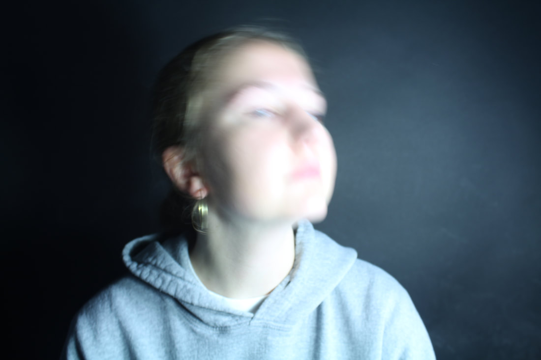
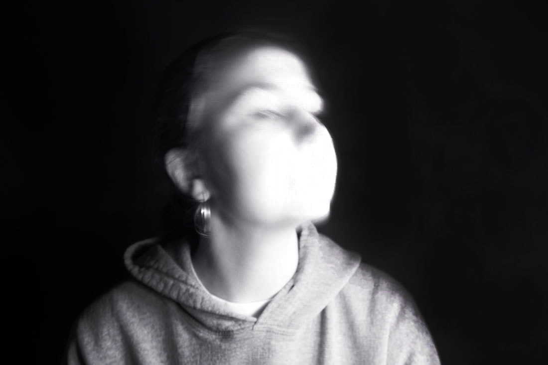
I like the contrast of the black and white on my images and how in most of them the white bits are very bright and vibrant. I also like how the movement made my models face blurred and to further distort my images i adjusted the settings to make the face brighter. To improve my images, I would overexpose them more when taking them so the white in my photos was even brighter and contrasting and have more images with blurred bits and interesting composition. I wish the mirror one was more distorted because then both sides of the mirror will be blurry and their would be two in one frame.
I like the contrast of the black and white on my images and how in most of them the white bits are very bright and vibrant. I also like how the movement made my models face blurred and to further distort my images i adjusted the settings to make the face brighter. To improve my images, I would overexpose them more when taking them so the white in my photos was even brighter and contrasting and have more images with blurred bits and interesting composition. I wish the mirror one was more distorted because then both sides of the mirror will be blurry and their would be two in one frame.
Documentary Portraits
Documentary Portraits are photos meant to show something important. They are sometimes a series of photos taken to show the progression of something. An example of an artists that uses this type of photography is Lewis Khan, who is interested in everyday-life and belonging.
Lewis Khan
Lewis Khan is a photographic artist born and raised in London, working with stills and motion. He uses the camera as a means to engage with the world around him. Lewis started shooting photos and videos freelance in 2015. His portrait-based practice is a study of emotion, relationships and belonging. He took a series of documentary photographs of his neighbour George over 6 years and entitled this project Georgetown. He took photos of him doing everyday tasks in natural setting and took pictures of objects in his house. Personal interest in community as a driving force in his work. Lewis’ practice is a deep exploration of the human experience with an interest in challenging conventional ways of representation - whether of youth, race, or urban environment.
Georgetown:

|
|

|
Khan cites his first foray in to moving image ‘Georgetown’ as a formative project that would go on to influence his approach to stills. The film is informed by six years of impromptu and informal meetings with local resident George, with Khan revisiting the subject over an extended period of time; an approach that he says has given his subsequent projects greater depth. The film was exhibited widely, most notably at The Photographer’s Gallery, and awarded first prize at Shuffle Film Festival by director Danny Boyle. He interviewed and photographed his neighbour George, taking documentary portraits of him doing his everyday tasks, like going shopping, talking, cooking and walking.
First Response:
|
|
|
|
Evaluation:
In this response I like the images with the busy office and it has a messy and somewhat chaotic vibe that Lewis Khan also uses. I also prefer the images where the persons face is on show so in my second response I would like to get more with my models faces actually looking towards the camera. Also some of my images came out blurry so I'm going to focus on that and make sure I have clear sharp images. I like all the colours in my images but i wish they were brighter and had the teachers doing more interesting tasks with more interesting backgrounds.
In this response I like the images with the busy office and it has a messy and somewhat chaotic vibe that Lewis Khan also uses. I also prefer the images where the persons face is on show so in my second response I would like to get more with my models faces actually looking towards the camera. Also some of my images came out blurry so I'm going to focus on that and make sure I have clear sharp images. I like all the colours in my images but i wish they were brighter and had the teachers doing more interesting tasks with more interesting backgrounds.
Second Response:

|

|

|

|
|
|
|
|
Evaluation:
I really enjoyed taking these photos as they are very maximalist. I like how I edited them and made colours stand out like the red and yellows. I got more images of the DT technicians face that I think came out really well. In my next response I would like to get more close ups of my model as all my photos are taken quite far away. Also with the model doing something and having close-ups of their hands doing task will create nice images. My favourite teacher to photograph was definitely the DT technician as his room was really good and chaotic and he looked into the camera and he was doing work with his hands.
I really enjoyed taking these photos as they are very maximalist. I like how I edited them and made colours stand out like the red and yellows. I got more images of the DT technicians face that I think came out really well. In my next response I would like to get more close ups of my model as all my photos are taken quite far away. Also with the model doing something and having close-ups of their hands doing task will create nice images. My favourite teacher to photograph was definitely the DT technician as his room was really good and chaotic and he looked into the camera and he was doing work with his hands.
At Home Response:

|

|
|
|
|

|

|

|

|
Evaluation:
I really enjoyed responding to the work of Lewis Khan and I think I responded well as I took pictures with my model in similar places to where he had his model. I edited my images to make them more vibrant and colourful to make them more attractive for the viewer's eye. My favourite image taken is the one of my models looking straight into the camera with their face focused and the background blurry. This image is effective because it focuses well on the model which is the point of the Georgetown project. the contrast of focus and un-focus works well in the frame and the vibrant and bright colours of the hair and the scenery behind creates a well-balanced image.
I really enjoyed responding to the work of Lewis Khan and I think I responded well as I took pictures with my model in similar places to where he had his model. I edited my images to make them more vibrant and colourful to make them more attractive for the viewer's eye. My favourite image taken is the one of my models looking straight into the camera with their face focused and the background blurry. This image is effective because it focuses well on the model which is the point of the Georgetown project. the contrast of focus and un-focus works well in the frame and the vibrant and bright colours of the hair and the scenery behind creates a well-balanced image.
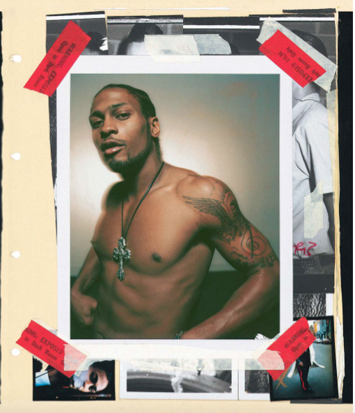
Ben Watts
|
|
|
Ben Watts started the project Big Up in 1990 and it is an impressive array of portraits featuring rappers, actors, boxers, dancers, skateboarders, children, and other street characters. London-born photographer Ben Watts started this collection when he came to New York from the Sydney College of Arts. The photographs contain sharpie notes and tape alongside other mixed media that give the images a unique stylised look. He became addicted to taking photos that pull out emotion and charisma because it brings out the other side to his modes. He published the book 'Big Up' in 2004 which contains all his street photography collages. He photographs celebrities in an editorial style where they do what they enjoy to make them feel comfortable.He was inspired by his 1st photography teacher and likes the collage style with Polaroids which the modes have written on.
My Response:

|
Muhammed Ali
Our photography teachers asked us all to respond the work of Ben Watts with Muhammed Ali. He was an American professional boxer and activist. Nicknamed "The Greatest", he is regarded as one of the most significant sports figures of the 20th century and is frequently ranked as the greatest heavyweight boxer of all time. Post retirement, Muhammad Ali worked as a humanitarian and activist. He donated millions of dollars to charity organizations, and it is estimated that he helped provide food for more than 22 million people affected by hunger across the world. In this response I really like the colour in my collage and how I highlighted him with a border of pink and it makes him pop out of the picture. To be more like the work of Ben Watts I used a lot of tape on my page and even did it around the whole page. I also noticed he had hole punched in his collage, so I added them to mine but to highlight them even further I stuck bright yellow post-it notes to the back underneath them. I really like how he fills the whole page with pictures, tape and writing and I think I achieved this quite well but if I was to do this again, I would try and make it even more busy with pictures and no blank space anywhere as I can see I have some in the bottom left of this collage. |

|
Tilly
This is my second response where we were asked to respond to the work of ben watts with images of ourselves and our environment. I really enjoyed creating this as it allowed us to be creative with how we out the images together and we had freedom to do it however we liked. I selected these images because they portrayed me well and showed me in different settings and with the people most important to me. I really like the look Ben Watts work and how he uses the masking tape to create a rough and home-made look. When creating my collage, I decided to place them in a neat way as that's how I prefer to do this. I understand this isn't really his style and if I was to do it again, I would have placed them in a different way. I did copy his technique of highlighting the big middle image with masking tape as I think it adds another layer to the poster and separates the bigger image from the other ones. I like the use of pink and how it is used all around to compliment my top and work well together. I like the contrast of the green behind myself to make me pop out of the page. I selected other things to go round my image other than photos as this is what Ben Watts does to further get to know his models and show all the sides of them to the viewer. I have my road, my surname and a heart with my initial in it as these images contain all the people I love. My favourite thing I added was my surname in that handwriting and it gives a rougher look to the poster whilst also being something to do with me and my name. |
Valerie Kabis 2nd Response:
Edited Images:

|

|

|

|

|

|

|

|

|

Evaluation:
I really like this idea and how the images came out. I really like the addition of the colours and the contrast between them and the black background. The blurred effect adds a new distorting and abstract effect to my model and the image as a whole. The brighter lights work best as they light up the models face more so they are more like the work of Valerie Kabis. I also really like how the image with two people came out as if fills up the blank space better and shows different types of distorted faces all in one frame. I prefer the colour images and I think it would look cool if I had the coloured people with a black and white background to highlight them in the frame.
I really like this idea and how the images came out. I really like the addition of the colours and the contrast between them and the black background. The blurred effect adds a new distorting and abstract effect to my model and the image as a whole. The brighter lights work best as they light up the models face more so they are more like the work of Valerie Kabis. I also really like how the image with two people came out as if fills up the blank space better and shows different types of distorted faces all in one frame. I prefer the colour images and I think it would look cool if I had the coloured people with a black and white background to highlight them in the frame.
Second Development:
|
|
|
|
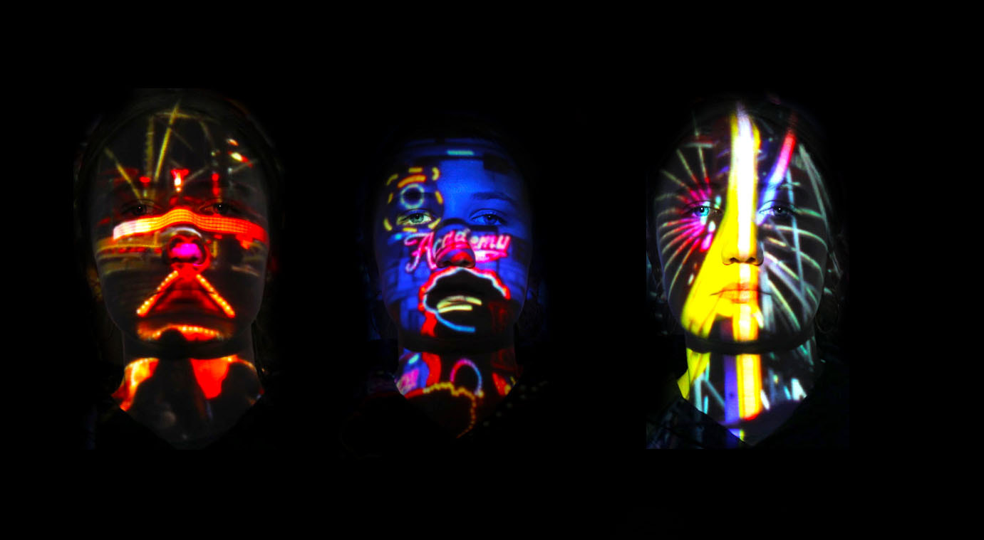
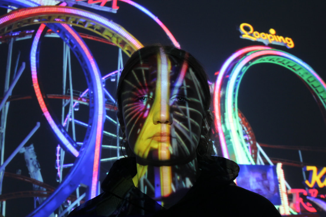
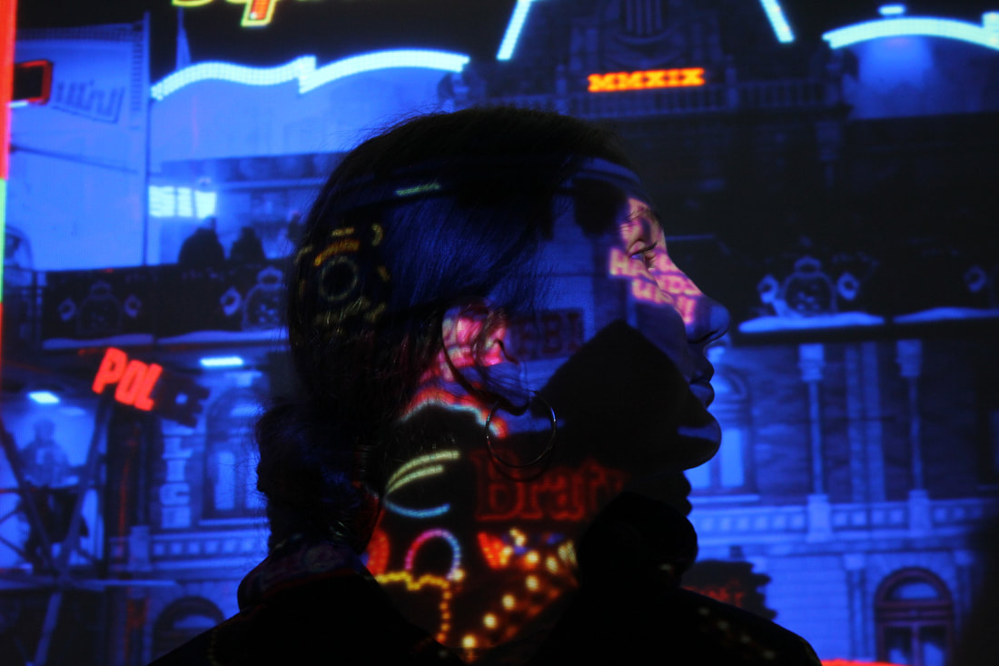
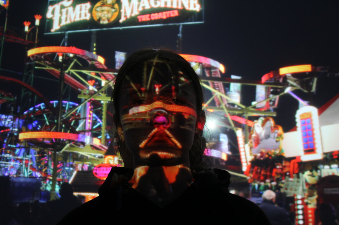
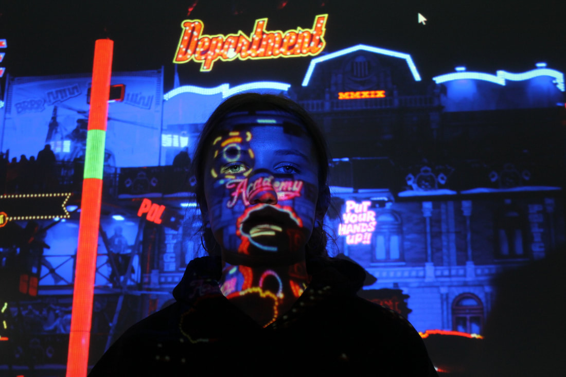
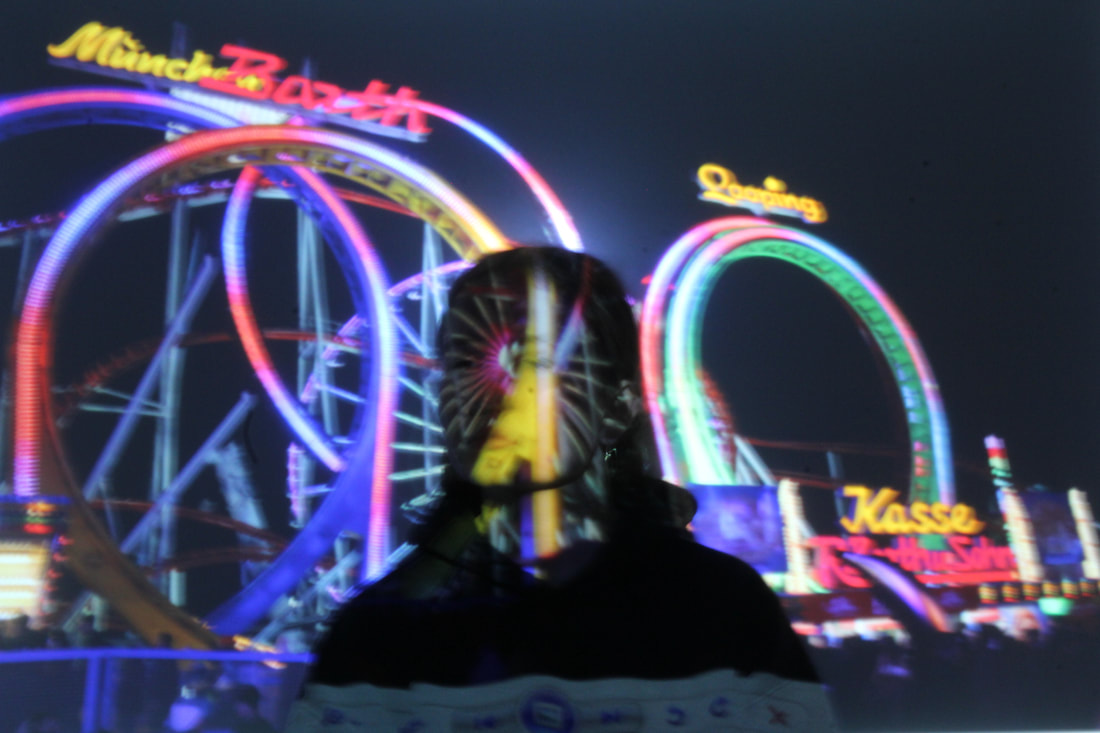
The Set Up:

|
How I did it:
I first took images at winter wonderland of my friends with colourful lights projected on their faces from the rides and created a blurred effect by asking them to move and by having a blurred shutter speed. After seeing and editing these images to make them look how I wanted them I realized I needed to develop it. I thought of projecting an image taken of the fun-fair rides and putting a model in front of it so the ride and bright colours would project on their face. I tried making their face blurred but it didn't turn out well and I preferred the clear, sharp image instead. Evaluation: I really enjoyed this whole project and development as it gave me freedom to be creative and take the photos I want to take. I've always really liked night photography and the contrast of the night and the sky with the bright and colourful lights. I think this worked really well to develop the work of Valerie Kabis as it added a new level to her work and made it more interesting to the viewers eye in my opinion. I prefer my images with a clear background and a clear models face as the background is busy and vibrant enough to be eye-catching and intriguing. I also like the shadows my model makes on the background and how this darkens in and highlights their feature, for example the hand where the writing is seen on the hand and the shadow is projected on the background. The models position also works really well as the writing as shapes are straight on their face. |
