WORD THEME
Wildlife Photographer Of The Year Exhibition

|

|

|
Artists Work:

|

|

|

|

|

|

|

|

|
Winner Of Wildlife Photographer Of The Year 2022

|

|
My Favourite Images:

|

|

|
Exhibition Review:
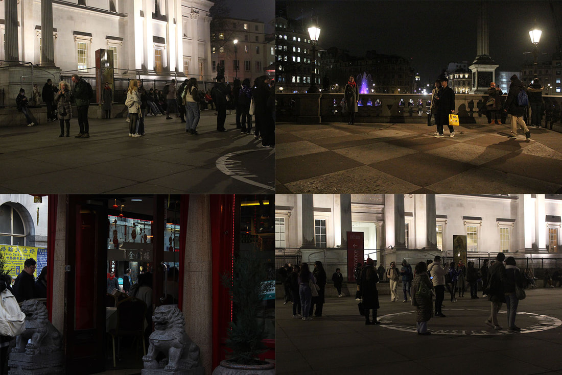
The exhibition was a show of 100 entries from different people for the wildlife photographer of the year for the year 2022 and the entries were made from October to November and anyone could enter. Many of the work related to climate change and how human factors are destroying animals habitat and life. Others were detailing the beauty of nature and animals. The exhibition had a open plan with 3-walled rooms with about 10 photos in each. Each artist had their photo and a explanation after of how and why they took the photograph. It was a open gallery where everyone walked around themselves. Their was a screen with a video playing which had artists giving more details of how they took their photos and how much work goes into taking wildlife photographs. I loved the work with a focus of 1 animal or a small amount of animals where they are the only thing in focus in the image as they captured my attention and brought light to one specific animal species. I really liked how small and intimate the gallery is as there wasn't many people in it and it looked very clean and all the photos stood out as their weren't many images there. This exhibition links to my theme of texture and framing as has inspired me to use focus to frame images.
The exhibition was a show of 100 entries from different people for the wildlife photographer of the year for the year 2022 and the entries were made from October to November and anyone could enter. Many of the work related to climate change and how human factors are destroying animals habitat and life. Others were detailing the beauty of nature and animals. The exhibition had a open plan with 3-walled rooms with about 10 photos in each. Each artist had their photo and a explanation after of how and why they took the photograph. It was a open gallery where everyone walked around themselves. Their was a screen with a video playing which had artists giving more details of how they took their photos and how much work goes into taking wildlife photographs. I loved the work with a focus of 1 animal or a small amount of animals where they are the only thing in focus in the image as they captured my attention and brought light to one specific animal species. I really liked how small and intimate the gallery is as there wasn't many people in it and it looked very clean and all the photos stood out as their weren't many images there. This exhibition links to my theme of texture and framing as has inspired me to use focus to frame images.
Tate Modern

|


|
Artists Work:

|

|

|

|

|

|

|

|

|

|
My Favourite Pieces:

|

|
Exhibition Review:
This exhibition was about colour, lines, history, nationality and so much more. There were just under 100 photographers work displayed and some even had a whole room to display only their work. The exhibition displayed work from the last 100 years so it was spread out in order of when each photograph or art was taken or made. The work was displayed on walls with each art work having a description about it underneath it or near it. We walked through it alone and got to explore the art works that spoke to us the most and could move as slow or fast as we wanted. There were videos and screens to show how some work was created which added interest to the viewers. The last three images really inspired me with my framing theme and project as I would like to explore the use of string and physically after taking photos. I've never attempted something like this so it would be something outside of my comfort zone but I'm exited to try it. This links to my theme of framing which I'm ready to experiment with.
This exhibition was about colour, lines, history, nationality and so much more. There were just under 100 photographers work displayed and some even had a whole room to display only their work. The exhibition displayed work from the last 100 years so it was spread out in order of when each photograph or art was taken or made. The work was displayed on walls with each art work having a description about it underneath it or near it. We walked through it alone and got to explore the art works that spoke to us the most and could move as slow or fast as we wanted. There were videos and screens to show how some work was created which added interest to the viewers. The last three images really inspired me with my framing theme and project as I would like to explore the use of string and physically after taking photos. I've never attempted something like this so it would be something outside of my comfort zone but I'm exited to try it. This links to my theme of framing which I'm ready to experiment with.
Eerie
Eerie is an adjective. If you describe something as eerie, you mean that it seems strange and frightening, and makes you feel nervous.
I'm going to go to Finsbury Park so I can photograph a road with lights and houses which is surrounded by 2 alley ways. I will do this at night as this is more eerie and the lights can shine onto the dark road and sky. I also want to incorporate a figure as I like how this looks in my inspiration pictures on my Pinterest board. However I want it to be a blurred figure as I want the viewer to be confused and not know who it is and want to look closer at my image. I also think this makes the image more eerie in a way as it is stranger and more abnormal.
I'm going to go to Finsbury Park so I can photograph a road with lights and houses which is surrounded by 2 alley ways. I will do this at night as this is more eerie and the lights can shine onto the dark road and sky. I also want to incorporate a figure as I like how this looks in my inspiration pictures on my Pinterest board. However I want it to be a blurred figure as I want the viewer to be confused and not know who it is and want to look closer at my image. I also think this makes the image more eerie in a way as it is stranger and more abnormal.
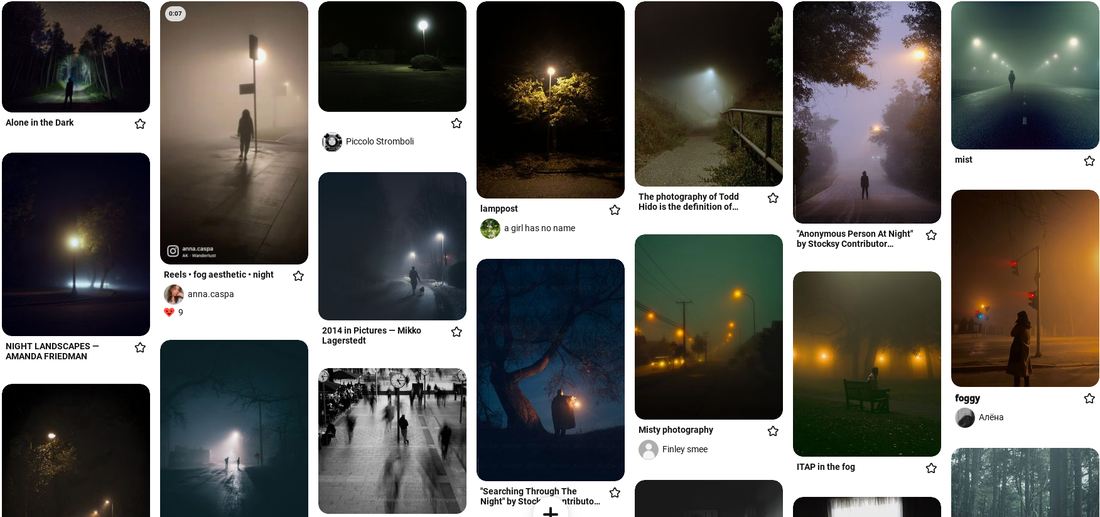
Todd Hido

|

|

|
Todd Hido is well-known for his photographs of landscapes and suburban houses across the United States, and for his use of luminous colour. Todd takes most of his photographs during long, solitary drives through American suburban neighbourhoods and then after edits the negatives together, manipulating them until he produces a picture that he feels truly portrays the encounter with a particular location. He uses lights to add contrast to his images and make the viewer focus on something in the frame that isn't the dark sky.
My Response:

|

|

|
Evaluation:
I like how every image has a light feature in it as this was something I wanted to focus on as I was really drawn to all the light in my inspiration photos. However, I would have preferred if the sky was darker in some of my images which could have been helped if I went out later. This meant the contrast on the light and the sky wasn't as much as I wanted it to be. On the other hand I like how in some images the grey clouds coming threw make the image more dramatic and powerful like the one on the top right. I like how I used a blurred figure but I could have done this more and experimented more with what the figure was doing and where they were. I think the most successful images are the ones of the street lamp in the distance because the light it centred in the middle of the frame and there is just the right amount of light from the streetlight covering the environment. There is a good sense of abandonment and loneliness in these images from the lack of cars and people, creating a unsettling atmosphere which I think is quite unusual and unique.
I like how every image has a light feature in it as this was something I wanted to focus on as I was really drawn to all the light in my inspiration photos. However, I would have preferred if the sky was darker in some of my images which could have been helped if I went out later. This meant the contrast on the light and the sky wasn't as much as I wanted it to be. On the other hand I like how in some images the grey clouds coming threw make the image more dramatic and powerful like the one on the top right. I like how I used a blurred figure but I could have done this more and experimented more with what the figure was doing and where they were. I think the most successful images are the ones of the street lamp in the distance because the light it centred in the middle of the frame and there is just the right amount of light from the streetlight covering the environment. There is a good sense of abandonment and loneliness in these images from the lack of cars and people, creating a unsettling atmosphere which I think is quite unusual and unique.
Texture

Texture refers to surface characteristics and appearance of an object given by the size, shape, density, arrangement, proportion of its elementary parts. A texture is usually described as smooth or rough, soft or hard, coarse of fine, matt or glossy.
I picked texture as my second word as I've always been intrigued by close-up photography and this will allow me to explore that further. I will take my pictures when I am away in Greece as I know the villa and its surrounding area is going to have a lot of interesting textures for me to photograph.
I picked texture as my second word as I've always been intrigued by close-up photography and this will allow me to explore that further. I will take my pictures when I am away in Greece as I know the villa and its surrounding area is going to have a lot of interesting textures for me to photograph.
Colin Winterbottom

|

|

|
Rather than documenting the city as he sees it in everyday life, Colin Winterbottom combines a heightened sensitivity to place with compelling compositions & unique perspectives to infuse urban landscapes with drama & mood. His photos seek to express not just what a place looks like, but how it feels to be there. At the core of most Winterbottom photographs is an interest in vivid textures & composition driven by dynamic tension between subjects in the frame. He loves to make photographs with strong tactile quality, where by looking at the image the viewer may feel the texture with their eyes as though they were touching the subject itself. His emphasis on texture is reinforced by his continued use of film to add pleasure and grain to his images.
My Response:

|

|

|

|


|

|


|

|

|

|

|


|


|


|
Evaluation:
I like how I've got a good variation of textures and how every image has a different texture. I also like how in some of the images you can't tell what has been photographed as this creates a sense of wonder for the viewer. I like how all my images are bright because I photographed things that were outside but it I wanted to explore further I could have taken images inside as well to be able to see if there is a difference and which version is more successful. The angle and composition of my images is also quite nice and appealing to the viewer. I like how I have shown a good variation in textures and because I took my images so close to the items and in focus, it makes the viewer feel as if they are touching the texture which adds a nice new layer to these images. The most successful are the ones of the tree as there is a lot of different textures on it and I was able to find a palm tree which was my best image because it had multiple textures and has a very sharp and clear feel to it.
I like how I've got a good variation of textures and how every image has a different texture. I also like how in some of the images you can't tell what has been photographed as this creates a sense of wonder for the viewer. I like how all my images are bright because I photographed things that were outside but it I wanted to explore further I could have taken images inside as well to be able to see if there is a difference and which version is more successful. The angle and composition of my images is also quite nice and appealing to the viewer. I like how I have shown a good variation in textures and because I took my images so close to the items and in focus, it makes the viewer feel as if they are touching the texture which adds a nice new layer to these images. The most successful are the ones of the tree as there is a lot of different textures on it and I was able to find a palm tree which was my best image because it had multiple textures and has a very sharp and clear feel to it.
Framing

Framing is a process whereby communicators, consciously or unconsciously, act to construct a point of view that encourages the facts of a given situation to be interpreted by others in a particular manner.
For my last word I chose the word framing and was really surprised and captivated by all the work I saw when I looked into it more and so I knew it was something I was wanting to do. For this shoot I will go to my local park with my model and use the trees to frame them. I Like the use of dresses in his images and how they stand out from the trees and nature so my model will be wearing a white dress so they don't blend into the trees, grass or leaves.
For my last word I chose the word framing and was really surprised and captivated by all the work I saw when I looked into it more and so I knew it was something I was wanting to do. For this shoot I will go to my local park with my model and use the trees to frame them. I Like the use of dresses in his images and how they stand out from the trees and nature so my model will be wearing a white dress so they don't blend into the trees, grass or leaves.
Saul Leiter - Blue Dress

|

|

|
The philosophy and intentions behind the work of Saul Leiter had a strong resonance with principles of Zen Buddhism, which celebrates the living in the moment yet without attachment to earthly pleasures. His approach to photography was therefore different from that of his peers who photographed in the same post-war period in America. Many of them had a clear intention to document for social causes and used photography as a medium to raise awareness, or advance their views on certain public affairs. Saul, however, remained largely apolitical, as far as his photographs were concerned. He was about capturing fleeting, ephemeral sightings in everyday life.
My Response:


|

|

|
Evaluation:
I really like how this shoot came out and how I was able to use the nature to frame my model in ways I wasn't expecting to. For example when I used the leaves and branches to bring out features of their face and using aperture to blur the model for added texture and for a bit of mystery. I like how bright the images are as it really brings out the green of the leaves and the white of the dress. If I was to do this again I would go to more locations and get a different variety of trees to see which ones look the best. I would also do more images of just framing the face as I really like how the ones I did came out. My most successful images are the ones of my model through tree branches as this is something I experimented with and ultimately allowed me to really focus on the features of my model all by using the natural environment around me.
I really like how this shoot came out and how I was able to use the nature to frame my model in ways I wasn't expecting to. For example when I used the leaves and branches to bring out features of their face and using aperture to blur the model for added texture and for a bit of mystery. I like how bright the images are as it really brings out the green of the leaves and the white of the dress. If I was to do this again I would go to more locations and get a different variety of trees to see which ones look the best. I would also do more images of just framing the face as I really like how the ones I did came out. My most successful images are the ones of my model through tree branches as this is something I experimented with and ultimately allowed me to really focus on the features of my model all by using the natural environment around me.
Framing Strands:
Strand 1: Framing with Transportation - Framing through windows
Ramatis Haywanon da Costa

|

|

|
Ramatis Haywanon da Costa's project ''she by the window'' was made to highlight the emotions and feelings of women in their everyday life that are normally ignored and belittled. Every day, thousands of people across Brazil take hours and hours to get home in precarious and expensive transportation. This project frames them through the windows showing reality, tiredness and strength. He names his images after the negative emotion he sees in the women he is photographing to highlight the struggles women secretly go threw when they think no one is watching.
My Response:


|


|


|

|

|

|


|

|
Evaluation:
For this response I really wanted to focus on getting a nice dark frame around the window as I want the people to be the main focus of the image and make sure that their facial expressions and what they are doing are the main focus of the image. I like the everyday feel to these images and how everyone is in there natural state. I especially like the images with multiple windows with different people in each window as I like how there are multiple people being framed in their natural environment all at once. The image with the women in blues arm on the pole is my favourite as she is the focus and her arm being up points the viewers eyes along the image nicely. I like how, especially towards the end, my images have come out almost like film strips and each window looks like a different photo. I really enjoy this idea and would like to develop this further.
For this response I really wanted to focus on getting a nice dark frame around the window as I want the people to be the main focus of the image and make sure that their facial expressions and what they are doing are the main focus of the image. I like the everyday feel to these images and how everyone is in there natural state. I especially like the images with multiple windows with different people in each window as I like how there are multiple people being framed in their natural environment all at once. The image with the women in blues arm on the pole is my favourite as she is the focus and her arm being up points the viewers eyes along the image nicely. I like how, especially towards the end, my images have come out almost like film strips and each window looks like a different photo. I really enjoy this idea and would like to develop this further.
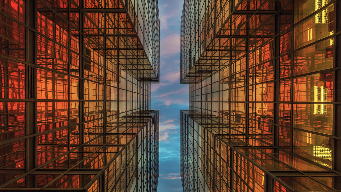
Strand 2: Framing with the sky and buildings
Andy Yeung
|

|

|
Andy Yeung is a photographer who focuses on landscapes, architecture & aerial photography. Being born-and-raised in Hong Kong, he learned to pull inspiration from the familiar when coming up with different ideas in the over photographed city. He wants to transform what he's seen into something new and artistic. For this response I will be focusing on trying to pull inspiration from and try to replicate his work on framing the sky and seeing the city from an unusual upwards perspective.
My Response:


|

|

|

|
2nd Response:
This time I walked around Bricklane and focused on using existing frames to frame the sky without any editing involved as I realised after editing the images above that it may look better without me editing and replicating images to create frames and instead use buildings and existing gaps to highlight the sky in my images.

|

|

|

|

|

|


|
|

Evaluation:
For this response I started out by looking at getting images similar to Andy Yeung and I attempted to take images looking upwards and framing the sky threw the side of building or gaps between buildings. After I took these I edited them to have 4 sides and made it all lined up by filling in the sky so there would be no harsh lines of where the pictures are coming together. After doing this and realising these images didn't come out that well I decided to start trying new and more interesting ways to frame the sky. As I was walking around leister square and old street I looked at how else I could frame the sky. I started taking images threw buildings, under bridges, under lanterns and threw graffiti. I really liked this challenge and enjoyed experimenting with the sky in this way. I like how the sky pops out of the images and I made this happen by mainly photographing threw darker buildings so the blue, yellow and white of the sky would contrast the rest of the frame and be what the viewers eyes are drawn to.
For this response I started out by looking at getting images similar to Andy Yeung and I attempted to take images looking upwards and framing the sky threw the side of building or gaps between buildings. After I took these I edited them to have 4 sides and made it all lined up by filling in the sky so there would be no harsh lines of where the pictures are coming together. After doing this and realising these images didn't come out that well I decided to start trying new and more interesting ways to frame the sky. As I was walking around leister square and old street I looked at how else I could frame the sky. I started taking images threw buildings, under bridges, under lanterns and threw graffiti. I really liked this challenge and enjoyed experimenting with the sky in this way. I like how the sky pops out of the images and I made this happen by mainly photographing threw darker buildings so the blue, yellow and white of the sky would contrast the rest of the frame and be what the viewers eyes are drawn to.
Strand 3: Framing the face
For this strand I am going to be experimenting with framing the face in a abstract way by framing each facial feature on its own and putting them together to make them stand out more. I am going to take close up images of my models face and put them together in a interesting way. I've never experimented with the body and face like this before so I enjoyed trying something new. I am going to use the whole body and just the face.

|

Evaluation:
I like the abstract feel the image on the top right image and if you examine the image closer you will see how I've tried to make it line up at different points including the right eyebrow, the hairlines and at the bottom the chin and the neckline. I especially like how the neckline and the jawline line up as it shows the different scales I have made the different facial features to further abstract her face. I like how the lips have been places and help to show the contrasting colours of her cheek and her neck. The eyes being a lot smaller then the nose is quite interesting and I like how I made them different sizes. |
Exhibitions Reviews
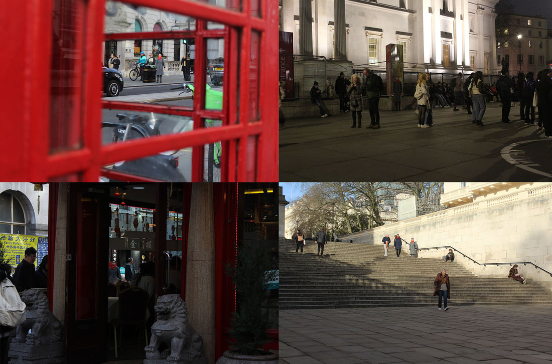
As a school we went to the photographers galley and the natural portraits gallery to see and be inspired by three different photographers. These were Paul McCartney, Johny Pitts and Evelyn Hofer. We explored each exhibition to try and get inspiration for our next development.
Exhibition Review 1 - Paul McCartney - Eye of the storm
|
This exhibition spanned across 1963-64 and was a collection of photos taken by Paul McCartney of his fellow bandmates. He captured the Beatles journey threw six cities over the course of the year where they went started in Liverpool then to London, Paris, New York, Washington DC and ending in Miami. The exhibition had a room for each city and the Paris and Miami rooms stood out to me in particular because the Miami photos were the only ones in colour and showed the Beatles in a more relaxed setting without any fans were they relaxed in and by a pool and went on boat trips. However when looking closer in most of the images taken you can see security in the background or with them which shows that they were never really truly alone and away from it all. I also liked the Paris room as the images were all close up which gave it a more personal side and it didn't have many fans and were just images with one person in showing of there fun side and there personality. I also liked the images taken through the cars as this is something I am interested in doing moving forward.
|

|
Exhibition Review 2 - Evelyn Hofer

|
Evelyn Hofer's exhibition spanned across a much longer time which was 45 years through 4 different US and European cities. The galley was spread across 2 floors and the images were placed in chronological order from when they were taken. I particular liked the series of images of just married couples as there was something simple and pure linking them together but they were all wearing such different clothing and different levels of happiness. I also liked the series of work taken in 1946 in New York as it engaged with people and places with an expressive use of colour. There was also a good use of layers and everything was perfectly composed in the frame. This exhibition showed me the variety of framing techniques I could use and I was particularly inspired by the use of colour to frame an image and have the focus of the image in colour and the rest of the image in black and white.
|

|
Exhibition Review 3 - Johny Pitts - Home is Not a Place

|
The project Home is Not a Place is all about documenting Black Britain and making everyday black experiences visible to create an alternative image of them in the future. The images were displayed in two rooms one fully lit and the other one dimmed with a living room set up in it. I preferred the images in the second room as they were all night photography images which is one of my favourite types of photography. One of the images that stood out to me was an image of a silhouette of a man which was a very dark image with not a lot of colour with the only source of light being an emergency sign above his head, drawing the viewers attention to his head. I also really liked the image that was a film strip with similar photos.
|
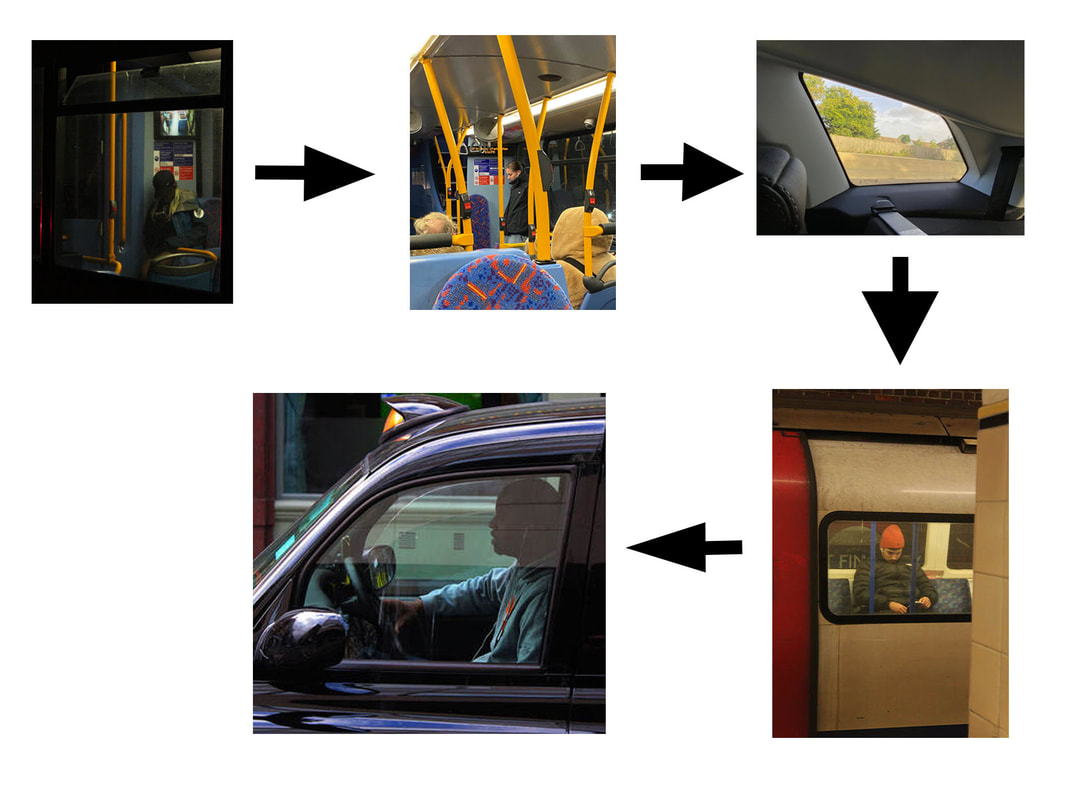
Framing with Transport
I've decided to develop Strand 1 as I found the contrasts of darkness and light of the bus to be very successful and powerful there. The black frame around the windows is very intriguing and creates a unique, natural frame. Building off the idea of natural frames, I want to experiment further with different types of transport.
Development 1 - Inside the bus
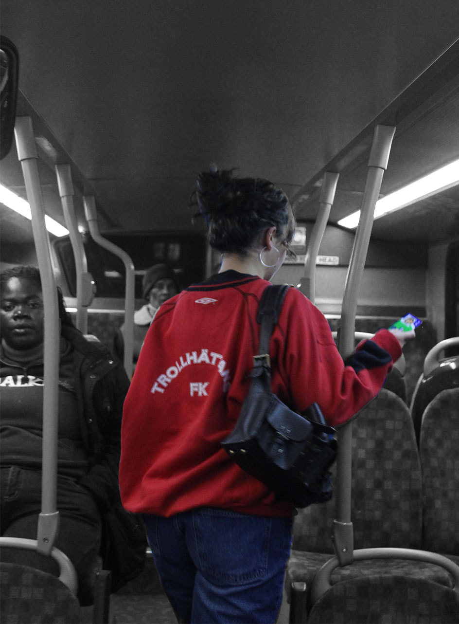
For this development am going to look inside the bus instead to see what I can frame within the bus and through the windows and see the bus interior instead of exterior. This changes the perspective of my images into the passenger of the bus and puts me in the position of the passengers I was photographing in my first strand. I want my images mainly at eyelevel as though they were taken through a passengers eyes. I am doing this to show how what everyone can see in a bus and may not take much notice of can be a well framed image and how there is framing in everyday items that most people don't notice.

|


|

|

|

|

|

|
Evaluation:
There is a good use of light in the images using street and car lights in the images through the window and also within the bus using the florescent lights and the boards. The image of the yellow handles is successful as the first as the last handle is the same position but the handles in-between are all in different directions and it gives depth to the image as the handles get smaller and smaller and further away. I also like how I've used both the window to frame things but also used things in the bus that naturally frame things in my images. The yellow poles really stick out to me in these images the way they create lines across the images, breaking it up into smaller sections and helping to guide the viewers eye is really successful. I was inspired to make use of these lines and different shapes when I noticed how many different shapes are in car windows, which led me to my next development.
There is a good use of light in the images using street and car lights in the images through the window and also within the bus using the florescent lights and the boards. The image of the yellow handles is successful as the first as the last handle is the same position but the handles in-between are all in different directions and it gives depth to the image as the handles get smaller and smaller and further away. I also like how I've used both the window to frame things but also used things in the bus that naturally frame things in my images. The yellow poles really stick out to me in these images the way they create lines across the images, breaking it up into smaller sections and helping to guide the viewers eye is really successful. I was inspired to make use of these lines and different shapes when I noticed how many different shapes are in car windows, which led me to my next development.
Development 2 - Inside car
For this development I am using a cars interior to frame the outside of it and the cars and lights around. I am trying to use all the windows of the car and see how differently they frame things and which I prefer the most. I really liked in the Paul McCartney exhibition when he used the front window of a car and use the mirror to frame so I will try and recreate this. I really enjoyed experimenting with a car like this and I want to experiment in the day and night.


|

|


|

|

|

|
Evaluate:
My images have good variation on different car windows used. I mainly photographed using the front window as I liked how it looked in other photographers images and wanted to recreate that. I like how I took images in both the day and night as in the ones in the night where darker and used the car lights and street and car lights to lighten the images. The ones taken in the day time have less contrast and have more flat images as the light in the image is all from natural light and is even across the whole image. I especially like the images of the windows that have interesting frames that aren't just straight and have some slanted edges as it creates a more dynamic image that is more intriguing to the viewer.
My images have good variation on different car windows used. I mainly photographed using the front window as I liked how it looked in other photographers images and wanted to recreate that. I like how I took images in both the day and night as in the ones in the night where darker and used the car lights and street and car lights to lighten the images. The ones taken in the day time have less contrast and have more flat images as the light in the image is all from natural light and is even across the whole image. I especially like the images of the windows that have interesting frames that aren't just straight and have some slanted edges as it creates a more dynamic image that is more intriguing to the viewer.
Development 3 - Outside a tube
For this development I am going to go take photos at my local tube station of people in and around tubes, using the windows, other people and doors to frame people. I am going to go at night so I can focus on the white florescent lights and the yellowy hue to my images. I want to focus on induvial people and how I can frame them well with the tube and surrounding area. I will mainly be using the window of the tube to frame people but I will also be trying to experiment with other ways of framing in and around the tube stations environment.
My Images:


|

|


|

|

Evaluation:
I really like the focus on one person in these photos as It means there is only one thing in the frame for the viewer to focus on. My favourite image is the image with the man walking as he is perfectly framed within the door and the although the background is kind of blurry and fuzzy he is quite focus and this adds contrast and makes him stand out. I like the use of the tube window to frame the people as the black boarder works as its own natural frame and separates them from the rest of the tube and environment. I especially like the two images with the people with red headphones and a orange hat as this adds a nice pop of colour which draws the viewers attention in and especially to their head and facial expression more then the ones with darker colours.
I really like the focus on one person in these photos as It means there is only one thing in the frame for the viewer to focus on. My favourite image is the image with the man walking as he is perfectly framed within the door and the although the background is kind of blurry and fuzzy he is quite focus and this adds contrast and makes him stand out. I like the use of the tube window to frame the people as the black boarder works as its own natural frame and separates them from the rest of the tube and environment. I especially like the two images with the people with red headphones and a orange hat as this adds a nice pop of colour which draws the viewers attention in and especially to their head and facial expression more then the ones with darker colours.
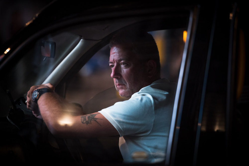
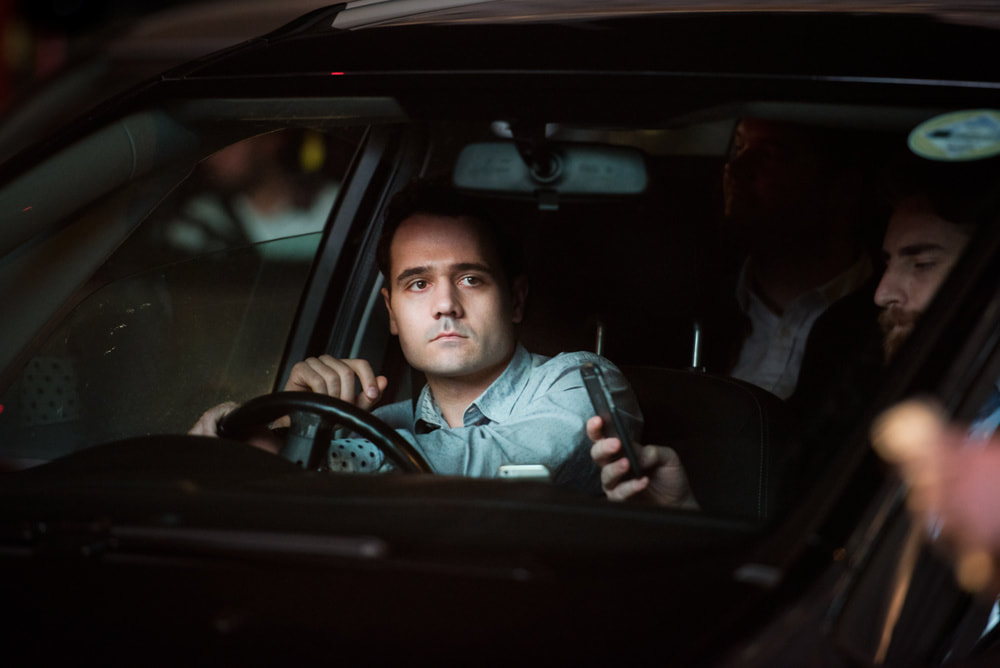
Development 4 - Oleg Tolstoy - Outside cars/vehicles
For this development I wanted to build upon the idea of framing the individual. I thought what better place to do that then in the car where most people are alone. To me, being in the drivers seat of your own car is a special place for most people and where they are comfortable and used to. In this development I really want to focus on this comfortable feeling to my images where the models are in a natural state and the viewer just gets a moment to see a snippet into their lives.
|
|
|
Oleg Tolstoy's work is firmly grounded in the real world. An intense curiosity for social interaction and human behaviour shapes his unique visual commentary. His imagery dives deep into the raw human emotion, finding the extraordinary in the everyday. Oleg's projects are united by their fresh perspectives on modern life. I loved the intimacy to his photograph and how he really gets close and shows the emotions of the people he takes portraits of. I really like all the colours he uses in the middle image and how it subtly distorts her face and are distorted on the glass. I intend to try and get some colourful images of people in cars but also the darker, more intimate ones by focusing on the driver and their emotion.
My Response: (Unedited)
Edited:

|

|

|

|

|


|

|

|
Evaluation:
I really enjoyed doing this shoot and even though it was tricky to get focused and sharp images from moving cars i think most my images came out well. I struggled with the reflections on the car and the fact they would sometimes block out the person so i came back later to take them in the dark without the sun. I think the night images came out better but the person is clearer and brighter in the daylight images because there is more light on them from the sun. I really like my first 2 edits I did and I think they highlight the person in the frame well. To improve I would edit the bottom images differently and not increase the contrast as much, i would lighten up the area around their face. I think I captured the intimate feeling to Oleg Tolstoys images well and I like how curve of the lines of the side of the windows looks.
I really enjoyed doing this shoot and even though it was tricky to get focused and sharp images from moving cars i think most my images came out well. I struggled with the reflections on the car and the fact they would sometimes block out the person so i came back later to take them in the dark without the sun. I think the night images came out better but the person is clearer and brighter in the daylight images because there is more light on them from the sun. I really like my first 2 edits I did and I think they highlight the person in the frame well. To improve I would edit the bottom images differently and not increase the contrast as much, i would lighten up the area around their face. I think I captured the intimate feeling to Oleg Tolstoys images well and I like how curve of the lines of the side of the windows looks.
Development Progression
Development 5 - Making a Bus
Willemvan Genk

|

|

|
Willem Van Genk is a Dutch Artist who creates art as a way of ordering chaos and he develops a highly personal mode of artmaking. He made these buses in the images from found materials. Many of Willem’s subjects were transport-themed cityscapes from across the globe. The travelling largely took place in his imagination assisted by a compendious library of reference books and magazines. Willem’s passion for transport included airships and planes, trains above and below ground, military vehicles and traffic of all types but especially trams and trolleybuses. It was the tram and trolleybus that he chose to translate into three dimensions in the form of wondrous improvised models that resembled apocalypse survivors in their scorched and battered state.
My Work:
Sticking to the theme of transport and the individual i am going to create a 3-dimensional bus to bring my images into a physical form.
For this development I am inspired by the work of Willien Van Genk and his passion for transport.I really like his 3 dimensional trams he makes but I'm going to modernise this and create a red London bus out of many different images. To create a bus I'm using cardboard and printed out images of people on the buses through the windows. I'm going to take individual images of each window on the bus and photo-shop it all together so each window has someone in it. It is going to be hard to get the scale right and make all the sides match.
For this development I am inspired by the work of Willien Van Genk and his passion for transport.I really like his 3 dimensional trams he makes but I'm going to modernise this and create a red London bus out of many different images. To create a bus I'm using cardboard and printed out images of people on the buses through the windows. I'm going to take individual images of each window on the bus and photo-shop it all together so each window has someone in it. It is going to be hard to get the scale right and make all the sides match.
How I made it:
I started by selecting the window I wanted to move to my image. I found a nice one with some colour and a person in it. Then, I carefully traced over the window and copied and pasted it onto the main image of the bus. This is where it gets a bit tricky and I had to do a few attempts to get it right. After I've got the image, I drag it and place it over the window I am replacing. A lot of the time it wouldn't fit right on the image so I would have to go back and retrace the window as many times as I needed to get it just right. I figured out that it was easier in some of the images to not get the black frame in it when tracing over the image with the polygon lasso tool. Finally, after this image is placed correctly, I repeat this process over and over until I have all the windows filled with images from all different buses.
My Images:


|

|
Evaluation:
I really liked the idea of making a 3-dimensional bus and how it brings my work to a whole new level where you can touch and feel my pictures and visualise them as an actual bus. However it was very tricky to get all the sides of the buses and all the individual windows so it took a very long time to make it. Also I couldn't decide if I preferred it in the daylight or nighttime so I made it half and half which I turned out quite well as you can see different times all in one piece. For my next development I will go back to online images and the mounting, measuring and fixing the images took a very long time and I don't think the outcome was worth it. If I was to do it again I would stay out even longer and try to get even closer to get better images of the front and back of the bus.
I really liked the idea of making a 3-dimensional bus and how it brings my work to a whole new level where you can touch and feel my pictures and visualise them as an actual bus. However it was very tricky to get all the sides of the buses and all the individual windows so it took a very long time to make it. Also I couldn't decide if I preferred it in the daylight or nighttime so I made it half and half which I turned out quite well as you can see different times all in one piece. For my next development I will go back to online images and the mounting, measuring and fixing the images took a very long time and I don't think the outcome was worth it. If I was to do it again I would stay out even longer and try to get even closer to get better images of the front and back of the bus.
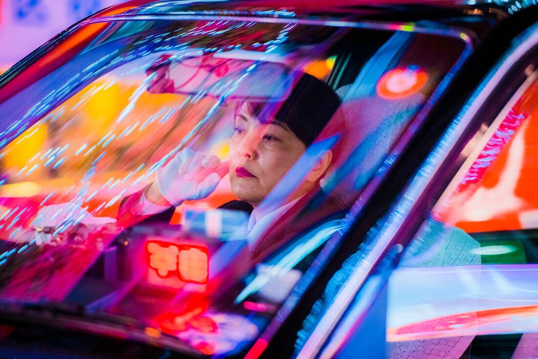
Development 6 - Focus on Colour & People
For this development I am going to focus even further on the individual but instead of using windows to frame them, I am now going to focus on colour to make them stand out even more. I noticed that in my last development that some of the images came out too dark and I want to experiment with colour more. I stumbled across Saul Leiters worked and his colourful street scenes. I am going to go out to my local Broadway and the streets of Pairs, drawing my attention to bright clothing, and layers I can frame my models in and also the idea of using an umbrella.
Saul Leiter


|

|
Saul Leiter is an American artists whose interest in painting began in his late teens. In 1946, when he was 22, he left the theological college he was attending in Cleveland and moved to New York City to pursue painting. Shortly after his arrival he met the Abstract Expressionist painter Richard Pousette-Dart, who was experimenting with photography. By 1948 Leiter had begun to experiment in colour, sometimes using Kodachrome 35 mm film past its sell-by date. His main subjects were street scenes and his small circle of friends. Leiter made an enormous and unique contribution to photography with a highly prolific period in New York City in the 1950s. His abstracted forms and radically innovative compositions have a painterly quality that stands out among the work of his New York School contemporaries. His earliest photographs in black-and-white and colour show an extraordinary affinity for the medium.
My Response:
For this response I really wanna focus on the red, yellow and bright colours I see whilst I was walking around in the rain. I initially intended to take my images through a frosted over window but I quickly realised there were none in my area. This meant I changed to photographing people with colourful clothing and I also noticed the buses driving past had rain on them so I tried using their windows. After taking my images I loaded them onto photoshop and made two layers and made one of them black and white, after I did this I used the eraser tool and rubbed out the person and their colourful clothes so they would stand out in the image. These are the edited pictures before I print them out and put them onto a contact sheet like Ruth Orkin.

|

|

|

|


|

|

|

|
Evaluation:
My initial intention was to photograph people through a window with condensation on it. However I quickly realised that I couldn't find any windows with condensation on it. I realised the buses did so I quickly got on and tried experimenting with the bus windows and people I could see through the window. I really focused on red and yellow colours I saw as these stood out to me in Saul Leiter's photographs and I tried to get people on their own as much as I could as I thought this came out the best and made them stand out even more. The most successful images are the ones with only one person and I think the images with red and yellow in them popped the most.
My initial intention was to photograph people through a window with condensation on it. However I quickly realised that I couldn't find any windows with condensation on it. I realised the buses did so I quickly got on and tried experimenting with the bus windows and people I could see through the window. I really focused on red and yellow colours I saw as these stood out to me in Saul Leiter's photographs and I tried to get people on their own as much as I could as I thought this came out the best and made them stand out even more. The most successful images are the ones with only one person and I think the images with red and yellow in them popped the most.
PARIS PHOTO - SKETCHBOOK

|

|

|

|

|

|

|

|

|

|

|

|
Development 7 - Writing on the contact sheet
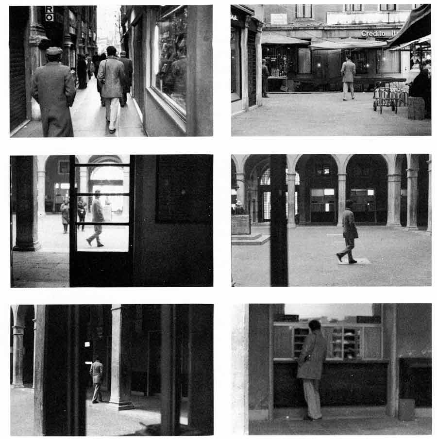
We went to Paris for 4 days to explore the city and visit many gallery's and exhibition as we could and in the end went to around 15 and Paris photo. Paris photo was a show of 100's of photographers of a range of skills and styles that we explored to gather inspiration from our favourite pieces of work. I was especially intrigued by the work of Ruth Orkin and Viviane Sassan as they didn't stick to the rules and norms that most photographers follow and just create what they want to do. I really liked how Viviane used layers when she made her photos physical and also coloured over them. Orkin, started taking pictures to document her travel and experiences, using her bike to frame her pictures and act as a trade mark to show the images are hers. Also, the way she created her own unique contact sheets with descriptions of each one making them all more personal and meaningful.
Ruth Orkin

|

|

|
In 1939, at the age of 17, Ruth Orkin crossed the United States alone with her bike, her camera and only $25 in her pocket. This “bike trip” across the United States took her from Los Angeles to New York, where she planned to visit the World’s Fair. Her journey and her audacity, exceptional for the time, aroused the curiosity of the local press, which devoted numerous reports to her while she was there. It was during this epic bicycle trip that Ruth Orkin sketched out the beginnings of her photographic style. The photographs taken on that trip are quite extraordinary and sophisticated for such a young girl, as is the scrapbook she diligently created documenting the trip. She later became a highly sought-after freelance photographer, travelling around the world.
My Response
For this Development I want to write about my images in this handmade contact sheet as it will further allow the viewer to try and understand the thoughts and decisions a photographer makes whilst planning and taking their photos. In Ruth Orkin's contact sheets she writes about where she is, who the person is or why she took the image. I'm really inspired by how this presents the image and shows the journey she took through the city's she visited and how it makes her images feel very unique and personal to her experience. To try and recreate this I want to travel through my city, London, taking photos when I feel I want to or something inspires me to take one. After that I will print out and create my own contact sheet as she does to explain each image and why I have taken it. I will also try my best to leave out the selective decision making of choosing which images to show and try to show them all to get show my raw photography pictures without any editing or subjective selecting. The black contact sheet also has links to my past responses and especially my first one of the buses at night as I used the darkness to draw attention to the lightness inside the bus and use the windows to frame my subjects. The intention is the same here. however the darkness is black card and the frame is the image itself.

|

|
Evaluation:
I really like this new way of presenting my images in a physical way as it made me pay closer attention to them and really think about the format to put my images to best present them to the viewer which will help me in my final piece. I think showing them in this way on a handmade contact sheet shows more care and draws attention to them more then just seeing the images just as they are. I also enjoyed the experience of giving some backstory to what the images was of and why I took it. This helped me reflect on my images more and tell the viewer more about what goes on inside my head whilst taking the actual photo. I wanted to show the progression of getting my coloured images and white pen to show how much better it looks after I changed the images and pen. I used black and white pictures to get the layout I wanted and then put the coloured photos over these.
I really like this new way of presenting my images in a physical way as it made me pay closer attention to them and really think about the format to put my images to best present them to the viewer which will help me in my final piece. I think showing them in this way on a handmade contact sheet shows more care and draws attention to them more then just seeing the images just as they are. I also enjoyed the experience of giving some backstory to what the images was of and why I took it. This helped me reflect on my images more and tell the viewer more about what goes on inside my head whilst taking the actual photo. I wanted to show the progression of getting my coloured images and white pen to show how much better it looks after I changed the images and pen. I used black and white pictures to get the layout I wanted and then put the coloured photos over these.
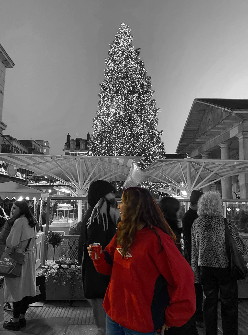
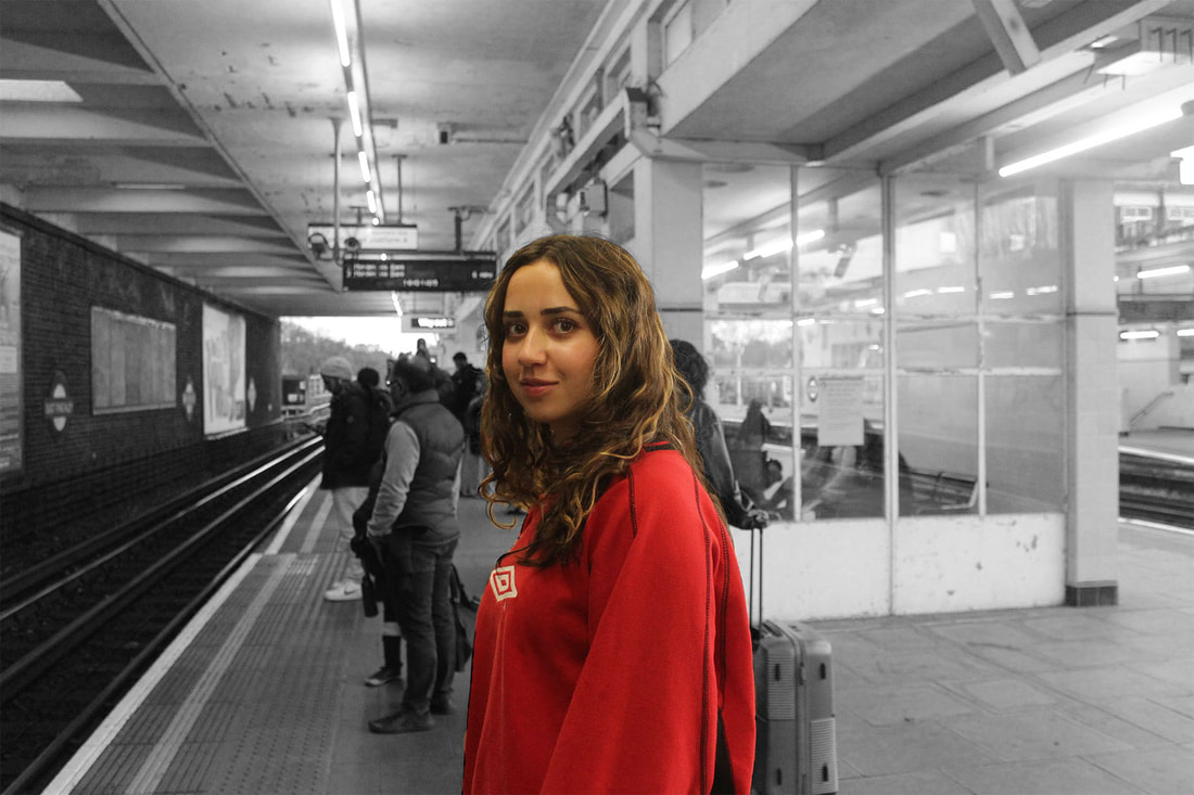
Development 8 - Following a Colourful Person
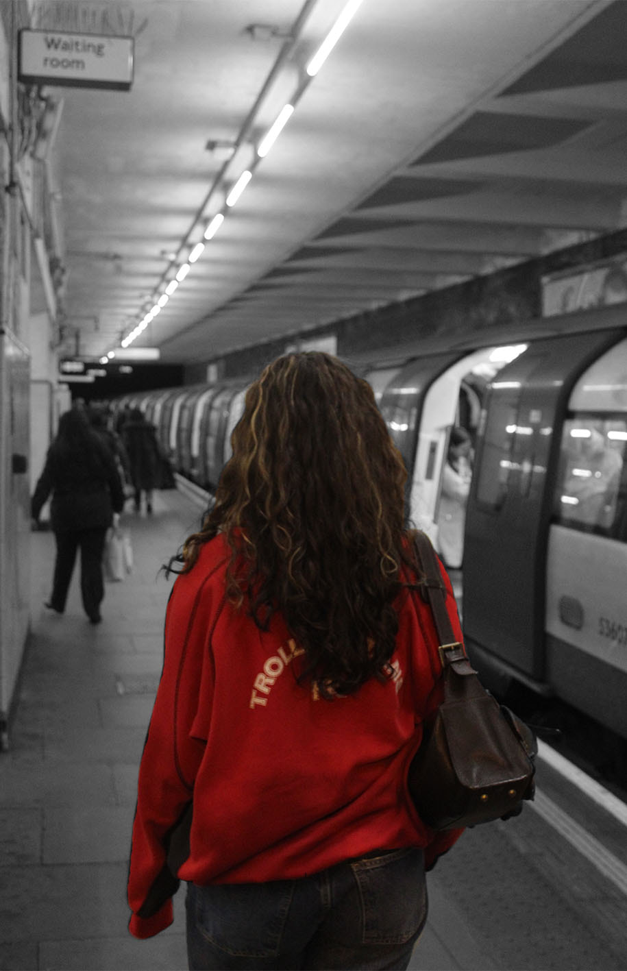
For this development I was inspired by how Ruth Orkin shows her journey through places in her own unique way. To do this development I travelled to central London with a friend and photographed her in and around transport on our journey. I wanted to capture her wearing a bright colour so I got her to wear a red jumper. After taking my images I edited them so she was cropped into the middle of the frame and so her surrounding are black and white and she is the only thing with colour. I picked red as it was a colour that stood out to me in Saul Leiters work and also I thought it would work well with the black and white background, which it does. I wanted to get her in a range of different palaces but in the tube station worked the best in my opinion as there wasn't that much going on in the background and there was a good mixture of light and dark tones to contrast the bright red jumper
|

|

|
|

|
|

|

|

|
|

|
Evaluation:
I really like the contrast and pop of the red jumper on the black and white background. I also edited the background colours to make them darker and lighter which gave them more depth and made the images look less flat. I am aware some of the images come across as if there are multiple layers and it doesn't merge that well together but overall I like how the images have turned out. After looking over my images again I have seen how they do look a bit over edited so for my next response I hope to elevate this. I will be turning these images into a contact sheet again like Ruth Orikin. The multiple layers problem has given me new inspiration to make my work more 3D and physically make the images have multiple layers by printing them out twice with one in black and white and one in colour and place my subject in-front of different backgrounds. The red jumper works really well over the black and white background but next time I hope to use different colours and experiment with them until I find the best one or maybe I will use multiple at once. I really enjoy working on my images physically so I will be doing this in my next development. |
Sophie Calle
Sophie Calle is a french photographer who portrays human vulnerability, and examines identity and intimacy. She explores what it is to be an observer as she stalks and writes down her findings with the precision of a police report or a psychiatrist’s case notes. Her line of work includes looking in depth and almost invading peoples private lives in a detective like way and displaying elements of her personal life in various ways. Despite her work being quite controversial, it is very unique and bizarre which makes people want to know more and explore the reasonings and explanations behind it. Calle’s secretive photography project began on her return to Paris in the late 1970s, when she decided to follow strangers through the streets while aiming to reacquaint herself with the city. She followed one of her Parisian subjects, Henri B on his trip to Venice. Sophie then decided to move to Venice and follow him around, documenting all of his movements. Her intention is to follow a person for the pleasure of following them, not because they were interesting. She was aiming to acquaint herself with the city.
Development 9 - Journey Through Transport
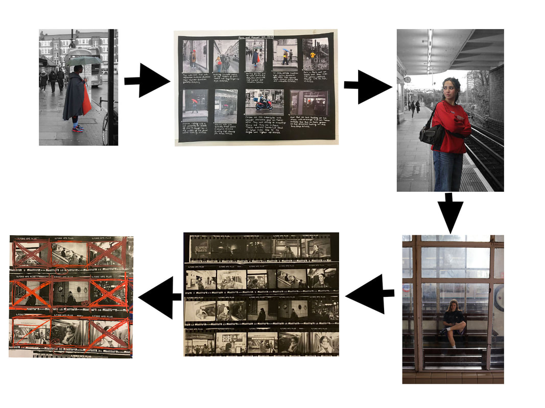
For this development I was inspired by the work of Sophie Calle as I wanted to continue my work on a wanted to focus on the individual as in development 3 I really liked how my images had a focus on one person and how I could frame them as an individual. Instead of following someone in France as she does, I am showing a journey into London. I'm also combining my other previous developments by using both the inside and outside of the tube to frame my model. I also wanted to create a journey and a story to give my photos a sense of togetherness and reason behind taking them. I've created a journey of my model walking to the tube, getting on the tube getting on another tube and leaving the tube and taken images of each stage and transport. For these images I have decided to focus on the rule of thirds when taking and editing my images and make my model and her head the middle of the frame so she is in a nice composition in the image.
My Images:


|


|


|

|

|

|

|

|

|

|

|
Evaluation:
I like how I experimented with different ways to photograph and frame my model, for example taking an image of my model's reflection in the window and use the circle mirror reflection to frame her. I like how there is a mix of inside and outside as there is both natural and artificial light. This gives a good variation to my images and makes them not all the same and different as they have different amounts of light and dark. One of my favourite images of this development is the one in the waiting room using the window and boarder to frame my model. I like how clear she is and how there is dirt/fog on the other windows which makes her stand out even more.
I like how I experimented with different ways to photograph and frame my model, for example taking an image of my model's reflection in the window and use the circle mirror reflection to frame her. I like how there is a mix of inside and outside as there is both natural and artificial light. This gives a good variation to my images and makes them not all the same and different as they have different amounts of light and dark. One of my favourite images of this development is the one in the waiting room using the window and boarder to frame my model. I like how clear she is and how there is dirt/fog on the other windows which makes her stand out even more.
Development 10 - Journey Through Transport on Film
For this development I am going to continue on the idea of the journey through transport with the focus on an individual and try to improve and get new ways to frame the individual and the environment they are in. I will also be changing my model to my sister instead to get a new face and change the model and get different images. My hope in taking the images on film instead is that I can use the contact sheet to further frame my images and develop it further again by drawing over the contact sheets to add colour and a new level to the images.


Contact sheet and test strip:
Before I started to enlarge my images I created a contact sheet so I could see all of them together and as the developed images instead of the negatives that come out of the film camera. I then selected my favourites and enlarged them to see them bigger. On the left, I have shown an example of a test strip I made before enlarging my image to find out how long to expose it for. This is really helpful to do and it means I can produce the best images possible. Some of my images needed more or less exposure time then others, depending on how dark or light the image was so testing the exposure time before is very important.
Before I started to enlarge my images I created a contact sheet so I could see all of them together and as the developed images instead of the negatives that come out of the film camera. I then selected my favourites and enlarged them to see them bigger. On the left, I have shown an example of a test strip I made before enlarging my image to find out how long to expose it for. This is really helpful to do and it means I can produce the best images possible. Some of my images needed more or less exposure time then others, depending on how dark or light the image was so testing the exposure time before is very important.

|

|

|

|

|

|
Evaluation:
I really liked experimenting with a film camera for this development as I haven't used one very much and I wanted to experiment with a different way to take my photos. I really enjoyed the process of taking them, rerolling them in a film spiel in a developing tank. However, one of the drawbacks of using a film camera is that I couldn't look at the images or delete or retake them so I could only hope and try my best to get them in focus and how I wanted them. This worked for some of my images, but it also meant some of my images were blurry, too dark or blocked by rain. On the other hand I also like how in a film camera the images will last forever and can't just be deleted or re-took.
I really liked experimenting with a film camera for this development as I haven't used one very much and I wanted to experiment with a different way to take my photos. I really enjoyed the process of taking them, rerolling them in a film spiel in a developing tank. However, one of the drawbacks of using a film camera is that I couldn't look at the images or delete or retake them so I could only hope and try my best to get them in focus and how I wanted them. This worked for some of my images, but it also meant some of my images were blurry, too dark or blocked by rain. On the other hand I also like how in a film camera the images will last forever and can't just be deleted or re-took.
Development 11 - Painted Contact Sheets
For this development I am going to take even more photos on a film camera but this time take the contact sheets and use coloured pen and paint to go over them and select and frame my favourite images and draw the viewers attention to them. But also doing this shows images a photographer doesn't like and shows the photos they reject at being good enough. I like how this method shows the work and thought process the photographer goes through after taking photos and selects their favourite images. Also I like the added colour this bringing to the black and white images and how it is a more unique way of framing images and it its a physical thing I can do to my images after taking and developing them.
William Klein

|

|
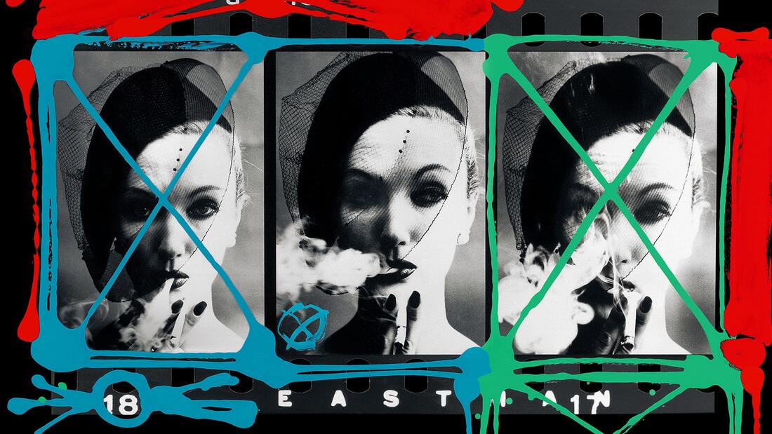
In painted contacts, Klein playfully defiles them with bright colours and graphic reframing that refocuses the viewer’s gaze, making his contact sheets into a new art form in and of itself. He explained his idea was to have a camera track along a strip of contacts, stopping at the chosen image with the commentary of the photographer explaining why for him that frame was successful. As the camera moved you’d see the misses, the nothing photos and then the hit. This approach created a remarkable feeling of anticipation, in the viewer and even in Klein himself. As the frames rolled by, a certain excitement would develop. Klein decided to utilize that anticipatory feeling from the short films and apply it to still photographs. Using his contact sheets as source material opened up an understanding of the larger photographic process, a sharp shift from looking at a clean print in isolation. The lead-in to the final result was as important as the final result itself, because it wasn’t hiding the thinking behind the winning print. The misfires were honoured as part of a photographer’s reality and, in fact, confirmed the favoured image’s composition to be the strongest. In this sense, Klein demonstrates how essential the selection and the editing process is to photography, determining the ‘chosen’ pictures amidst less-captivating brethren. The viewer’s eye can wander, but Klein has directed the spotlight.
My Response:


|

|

Evaluation:
I really like how my painted on contact sheets came out in the end. I did a lot of experimentation with different colours and ways to draw over my images and came to the conclusion two or three colours worked the best and thinner paint pens looked the best as I had a lot of control of how rough, thick or thin the lines were. I tried my best to recreate his images so mine looked similar to his and I think I was successful. I really like how he circles and crosses the images he selects and very obviously crosses ut the ones he didn't choose. The way that this allows the viewer to see that not every photo a photographer takes works out how they want is quite inspiring as it shows how much work is taken to take the 'perfect' image and how we have to take a lot to get the image to come out how we want it to.
I really like how my painted on contact sheets came out in the end. I did a lot of experimentation with different colours and ways to draw over my images and came to the conclusion two or three colours worked the best and thinner paint pens looked the best as I had a lot of control of how rough, thick or thin the lines were. I tried my best to recreate his images so mine looked similar to his and I think I was successful. I really like how he circles and crosses the images he selects and very obviously crosses ut the ones he didn't choose. The way that this allows the viewer to see that not every photo a photographer takes works out how they want is quite inspiring as it shows how much work is taken to take the 'perfect' image and how we have to take a lot to get the image to come out how we want it to.
Development Progression
Development 12
Gilbert and George - Dirty Word Pictures

|

|

|
The Dirty Words Pictures juxtapose graffiti swear words and slogans with disturbing images of urban life and the bleak presence of the artists themselves. Relentlessly exploring aspects of 20th century turmoil, the pictures reveal much about the changing face of urban living and shifting attitudes towards sexuality. Gilbert & George used the microcosm of London’s East End to represent society at large. In stark black, white and red, these challenging pictures asked many questions of the viewer.
Journey Through London
For this development I am going into London to shoot another set of film of a different model. This time I wanted to focus more on further away images and of the figure of an individual instead of facial expressions. I really like the experimentation with black and white on Gilbert and Grorge's collages and I want to do something similar by having some images inverted. Also I want to experiment with writing over my images as they have words in their collages but to link to William Klein's work on focusing the viewers attention on what I want them to see and notice in my images and evaluate my work on top of it.
Contact Sheet:

Experimentation with Techniques:


|

|

|

|
Favourite Pieces:

|

|

|
Evaluation:
I started off by experimenting with the use of words over my contact sheet explaining what I liked and didn't like about my images. However after experimenting with a mix of inverted and non-inverted images, I much preferred how this came out. I also found out that I preferred how it looked when I kept to one colour or shades of a colour as it looked less mix-matched and random. For my final contact sheets I cut out strips of inverted both horizontally and vertically to make a sort of striped pattern to my contact sheet. To kept the two types of images separated, I only drew over the non-inverted images as it made it easier for the viewer to see the difference in images then when I dew over all the whole contact sheet. The final images came out really well and I like how they are neatly made and well thought-out whilst still having the messy look with the Posca pens on top.
I started off by experimenting with the use of words over my contact sheet explaining what I liked and didn't like about my images. However after experimenting with a mix of inverted and non-inverted images, I much preferred how this came out. I also found out that I preferred how it looked when I kept to one colour or shades of a colour as it looked less mix-matched and random. For my final contact sheets I cut out strips of inverted both horizontally and vertically to make a sort of striped pattern to my contact sheet. To kept the two types of images separated, I only drew over the non-inverted images as it made it easier for the viewer to see the difference in images then when I dew over all the whole contact sheet. The final images came out really well and I like how they are neatly made and well thought-out whilst still having the messy look with the Posca pens on top.
Development 13 - FINAL PIECE
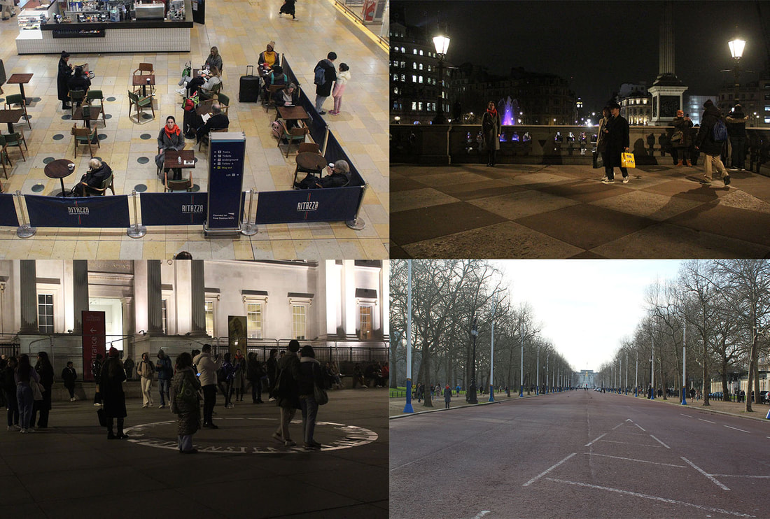
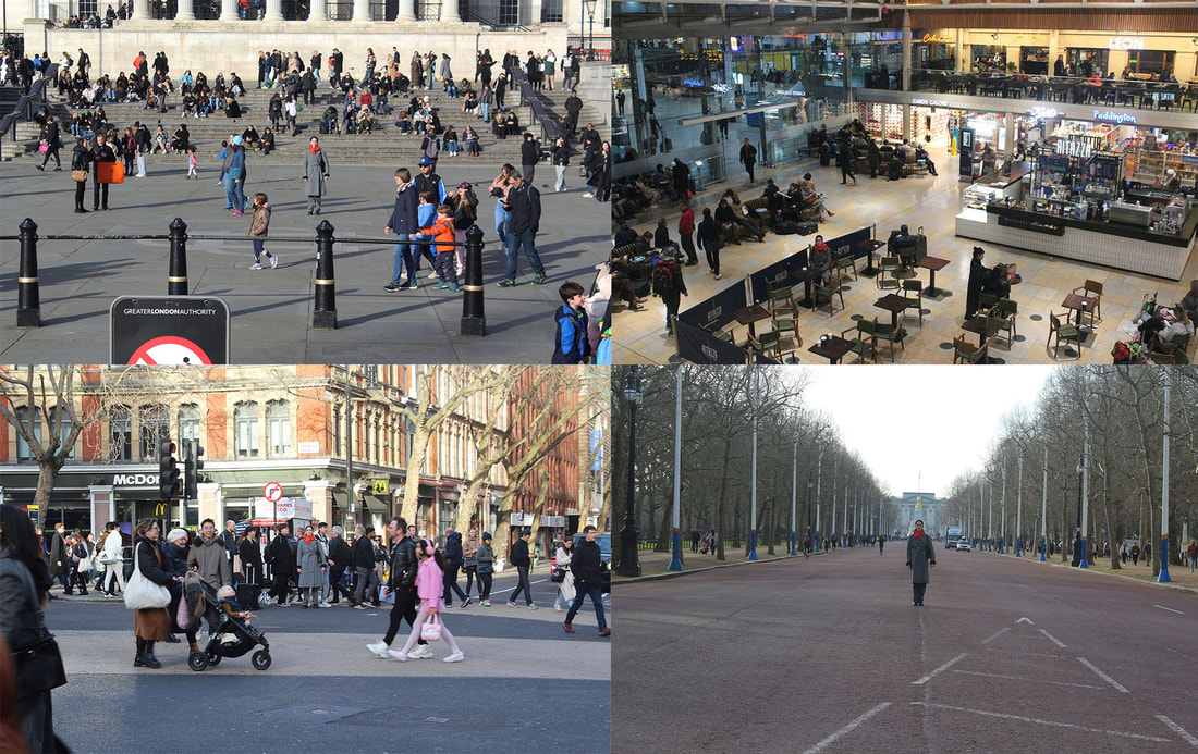
For this development I went into central London with my sister as my model. I wanted her in a long grey coat to blend into the business and formally dressed people that rush around London all day. I wanted her to have an orange scarf so she would pop out of the image in a subtle but bright enough to catch the eye that is looking for it. A mix of far away and close up images are something I want to focus on and see which I prefer, I want to mainly focus on how easy it is to become lost in London and become part of the croud, unnoticed and ignored unless you are drawn towards someone. I'm drawing the viewer towards my model with the use of a bright colour, a powerful stance and a feeling of curiosity of where she will be as you look through more of the images. I want to have a mix of my model in the middle of the frame and to the side to make it harder for the viewer to find her but also have her clearer in some images.
My Images:


|

|


|


|


|

|


|

|
Experimentation with formations:
|
|
Final Pieces
To make my final images I firstly took inspiration from William Klein and my past development with the use of a contact sheet however I instead used it digitally and used Photoshop to put my images in each square to link in nicely with my last development. I really tired to position my images in a way that if there were two similar images I wouldn't put them close together if they are in the same location or angle. Doing the contacts digitally definitely took a long time to try and place the images just how I wanted but it was less time consuming then developing an actual contact sheet is and I am able to customise the contact sheet as much as I want and rearrange or take out images which isn't possible on an normal contact sheet.

Evaluation:
I think my final edits are very successful and I like how I arranged my images so that dark images, taken at night and brighter images, taken in the day are placed in separate groups as it is very clear how much more creepy the images in the dark are and how its more like there is a figure hiding in the darkness that is easily not seen and could be anyone. I really like how I experimented with having my model further away from the camera then in my other shoots as I like how she blends in nicely with the surroundings but sticks out when the viewer knows who to look for.
I think my final edits are very successful and I like how I arranged my images so that dark images, taken at night and brighter images, taken in the day are placed in separate groups as it is very clear how much more creepy the images in the dark are and how its more like there is a figure hiding in the darkness that is easily not seen and could be anyone. I really like how I experimented with having my model further away from the camera then in my other shoots as I like how she blends in nicely with the surroundings but sticks out when the viewer knows who to look for.
